According to a recent report from CNBC, Ethereum has just completed its “final dress rehearsal” for the so-called Merge, which will shift the second-largest cryptocurrency by market value from a “proof of work” validation protocol to “proof of stake.” As CNBC notes, this upgrade has been years in the making and is considered “one of the most important events in the history of crypto.”
The reason is simple: efficiency. Moving to “proof of stake” will reduce Ethereum’s carbon footprint over 99.5% per its internal estimates, and also significantly lower its “gas” prices, i.e. the cost of transactions. Carbon emissions and the cost of converting crypto to fiat currencies (or other crypto currencies) are the two major criticisms of Ethereum, in particular, and crypto, in general.
Network will be more secure and less prone to manipulation
The Merge is not only important to the investing public, however; it’s a critical upgrade for the crypto community. The Ethereum network will now be more secure and less prone to manipulation. For example, anyone who wants to take over 51% of the network will now need to hold half of the total staked amount in ETH, rather than 51% of the mining hash power, as was the case previously. What this means is that the platform is guaranteed to be controlled by those who have a long-term interest in its success, ergo the term “proof of stake.”
But it’s the lower “gas fees” that will probably attract the most attention: and have the most profound effect on adoption. As the cost to process any transaction on the Ethereum blockchain goes down, more adoption will occur, meaning more people will be more open to participate in Ethereum blockchain projects. Think of how stock trading took off in the 1980s after US markets were deregulated and the world’s first discount stockbroker, Charles Schwab, opened for business. More recently, Robinhood spurred another surge in trading by reducing the cost of stock transactions to zero. This is commonly referred to as the “democratization” of investing. With the Merge, a similar revolution is coming to crypto. Continue Reading…
Is it just me, or do investors have a knack for overcomplicating things?
Take the argument about active versus passive investing. We’ve known for more than 30 years that, after costs, the return on the average passively managed dollar must beat the return on the average actively managed dollar. Nobel laureate William Sharpe demonstrated this for us in his 1991 article, “The Arithmetic of Active Management,” and nothing has changed since then.
Despite that scary word, “arithmetic,” you don’t need to be a math major to accept Sharpe’s conclusions and invest accordingly. Still, you may want to see for yourself what he’s talking about. In the first episode of our Index and Chill video/blog series, we’ll show you why active investors (as a group) are destined to underperform passive investors.
Dividing and Conquering the Canadian Stock Market
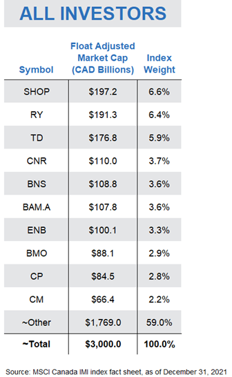
To demonstrate how Sharpe’s theory plays out in action, let’s illustrate his work using the Canadian stock market as our example. The Canadian stock market is made up of hundreds of companies, with a total value of around 3 trillion dollars. If we sort these 300 or so companies from largest to smallest based on the value of their shares available to regular investors, we find familiar names at the top of our list, including Shopify, Enbridge, and the Big Five banks.
Dividing each company’s value by the total value of the Canadian stock market provides us with a percentage weight for each, otherwise known as its “index weight.” For example, at the end of 2021, Shopify had the largest index weight, at around 6.6%, followed by RBC and TD, which made up 6.4% and 5.9% of the Canadian stock market, respectively. These weights guide index fund managers on how much to allocate to each company in their funds.
So, here’s where Sharpe’s work applies: At any point in time, investors as a group must hold all available shares of these companies. So, it stands to reason that, as a group, investors also collectively receive the total return of the Canadian stock market. In other words, if the Canadian stock market returns 10% this year, or around 300 billion dollars, everyone invested in the market will receive 300 billion dollars to divvy up amongst themselves.
Zero-Sum Games
Of course, some market participants will receive a higher return. But for each winner, there must be one or more losers.
This is the concept behind zero-sum game theory. The holdings of all investors in a particular market combine to form that market. So, if one investor’s dollars outperform the market over a particular period, another investor’s dollars must underperform, ensuring that the dollar-weighted return of all investors equals the return of the market.
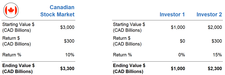
Let’s use a super-simplified example to illustrate this point. Sticking with our $3 trillion-dollar Canadian stock market, let’s assume there are only two investors in the entire market. Investor 1’s portfolio is worth 1 trillion dollars and Investor 2’s portfolio is worth 2 trillion dollars. Combined, they are the Canadian stock market.
Of course, Investor 1 and Investor 2 wouldn’t be much fun if they didn’t have different opinions about which stocks were going to outperform over the next year. Based on their preferences, they trade with each other until they are both relatively happy with their portfolio.
Over the next year, let’s say the Canadian stock market returns 10%, providing a total dollar return of 300 billion to our two investors. But Investor 1’s stock picks end up returning 0%, while Investor 2’s portfolio earns an impressive 15%, or 300 billion dollars. Investor 2 was able to earn an additional 100 billion dollars by “winning” this amount from unlucky Investor 1. But again, as a group, there was no way the pair could earn more than 300 billion dollars. In a zero-sum game, the winner’s gain comes at the expense of the loser’s loss, with zero “extra” money floating around unaccounted for.
Setting the Stage: Active vs. Passive Participation
Now, let’s look at how this zero-sum game stuff applies to active versus passive investing.
To illustrate, we’ll return to our $3 trillion Canadian stock market, and each company’s weighting within the total market.
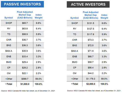
But instead of imagining Canada’s total market is divided between two active investors, let’s establish a slightly more realistic model. We’ll assume passive investors as a group hold one-third, or $1 trillion of all Canadian company shares, and active investors as a group hold the remaining two-thirds, or $2 trillion. We’ll once again assume the overall Canadian stock market returns 10% this year, but with one critical caveat. That 10% is before costs. As we know, extra investment costs can add up quickly from management fees, bid-ask spreads, commissions, and other tricks of the trade.
I want to also point out that the particular split between passive vs. active makes no difference to our exercise. Since these passive and active investors as a group are the total Canadian stock market, and since the passive group’s holdings have the same percentage weights as the overall market, the active group’s holdings must also have the exact same percentage weights. In other words, however you slice it up, the pie is the pie, with the same ratio of ingredients in the mix.
Passive Pursuits
Let’s now look at how our passive investors would have fared with their $1 trillion market share. With these assumptions, if the market returned 10%, the passive investor group would be expected to earn $100 billion, before costs.
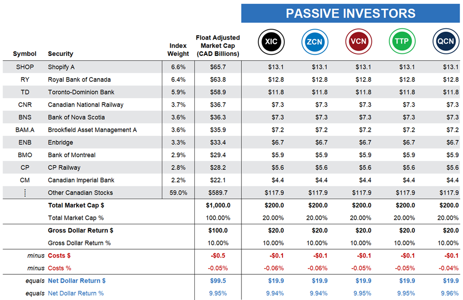
Now, suppose you are one of five passive investors in the Canadian market, with about $200 billion to invest — or one-fifth of the passive investors’ $1 trillion market share.
You don’t have a fancy business degree, and you’ve never even glanced at a company’s financial statements. You’d rather just buy and hold a low-cost index fund or ETF that tracks the broad Canadian stock market, so you invest your $200 billion in the iShares Core S&P/TSX Capped Composite Index ETF (XIC). XIC’s fund managers would use your money to purchase hundreds of Canadian stocks on your behalf, each according to its weight in the index. For example, they would purchase $12.8 billion of Royal Bank stock, or 6.4% of your $200 billion … and so on.
A year goes by, and in our illustration, you receive the stock market return of 10%, before costs. That’s $20 billion on your $200 billion investment. And because passive investing costs are low, your after-fee return will be around 9.94%, or just slightly less than the market return.
Your four fellow passive investors choose comparable broad-market Canadian equity ETFs that deliver similar after-cost returns. So, on average, the passive group earns around 9.95% after costs.
Active Adventures
Next, let’s turn to our active investors, who continue to hope or believe they can beat the market, even after costs. We’ll again assume there are only five investors in our active management group, and they all have the same $400 billion each to invest.
However, unlike our passive camp, our active investors do not all share a similar approach to investing; each will pursue a different tactic.
Our first active investor selects a portfolio of funds recommended by their favorite banker who is a so-called “closet indexer.” This banker is afraid of losing their job if their recommendations stray too far from the popular benchmarks, so their preferred funds closely follow a passive approach … but with a catch. Their fund management fees are a hefty 2.5%. As a result, our closet indexer earns the market return of 10% before fees, but their net, after-cost return shrinks to 7.5%. Continue Reading…
Harvest ETFs CIO explains that as markets take a breather, the healthcare sector continues to show defensive characteristics with exposure to growth prospects
The healthcare sector offers a unique combination of defensive and growth-oriented prospects. Photo Shutterstock/Harvest ETFs
By Paul MacDonald, CIO, Harvest ETFs
(Sponsor Content)
US large-cap healthcare has been a bastion for investors in an otherwise rough market. While not fully insulated from the broad sell-off we’ve seen in recent months, the sector has outperformed due to stable demand, high margins and relatively low commodity price exposure. The Harvest Healthcare Leaders Income ETF (HHL:TSX) combines a portfolio of diversified large-cap healthcare companies with an active covered call strategy to generate consistent monthly cash distributions. The portfolio’s defensive positions, plus its income payments, has resulted in significant outperformance of broader markets.
In the wake of July earnings data, however, we saw some relief come to the broader markets as companies across sectors reported largely in line with expectations, providing much-needed visibility. As markets breathed a sigh of relief, growth-oriented sectors like tech started to pare back losses from earlier in the year. While the healthcare sector has shown its reputation for defensiveness in recent months, we are also seeing that the sector’s growth tailwinds are making a greater impact.
This whole space is innovative: whether that’s a company leading the way on robotic-assisted surgery, or a huge established player like Eli Lily making strides in obesity medication. Healthcare companies have significant growth tailwinds and, in our most recent rebalance of HHL we’ve taken some steps to capture more of those growth prospects.
Positioning HHL for growth prospects
We would stress that the recent rebalance in HHL maintained the ETF’s commitment to subsector and style diversification within the healthcare sector. However, some of the new additions to HHL have positioned the portfolio for greater growth opportunity.
The first move was replacing Agilent Technologies with Danaher in the portfolio holdings. Both companies focus on life sciences, tools & diagnostics, but Danaher has a more diverse line of businesses and a larger market share, which in our experience better positions Danaher for any potential market recovery.
The second move in the rebalance was to remove HCA Healthcare Inc, a value position which had shown worsening earnings visibility and rising costs due to labour issues and add Intuitive Surgical. Intuitive Surgical is the market leader in robotic-assisted surgery, with technology almost a decade ahead of its closest competitor. The robotic-assisted surgery market is currently underpenetrated, and a number of companies are making strides in the space: including Stryker, another HHL portfolio holding. The addition of Intuitive Surgical positions HHL to better participate in that subsector’s growth prospects.
While moves like these are designed to position HHL for improved growth prospects, we should emphasize that the whole portfolio is designed for diversified exposure to the growth opportunities and defensive characteristics inherent in the healthcare sector.
Maintaining defense while capturing growth opportunity
It’s ironic. We can easily think of specific investment sectors as a value-growth binary, trading off one for the other. But the healthcare sector isn’t so simple. Some of the largest companies in this sector have incredible growth prospects due to innovations in treatments, pharmaceuticals, and patient service. At the same time, given the large-cap focus we take in HHL, even our more growth-oriented names have market shares and barriers to entry that can be seen as highly defensive.
Those characteristics have shown themselves throughout 2022, as low commodity price exposures and high margins kept the sector in a state of outperformance. HHL is also one of the 6 Harvest ETFs held in the Harvest Diversified Monthly Income ETF (HDIF:TSX), where it contributes to the overall defensive position of that core portfolio.
There are also two aspects of HHL that beef up its defensive traits: diversification and covered calls. Continue Reading…
A look at the “Top Dividend” stock list on the TMX website will show an investor a selection of the highest yielding investment funds and stocks available in Canada. That list features some astronomically high numbers on investment funds: yields upwards of 20%. An income-seeking investor might look at those numbers and rush to buy, believing that with a 20%+ yield, their income needs are about to be met.
As attractive as the highest-yielding investments might appear, there are a wide range of other factors for investors to consider when shopping for an income paying investment fund. Investors may want to consider the crucial details of how, when and why that yield is paid as income: as well as their own risk tolerances and investment goals. This article will outline how an investor can assess those factors when deciding what income investment fund is right for them.
Looking ‘under the hood’ of the highest-yielding investment funds
If you see a big yield sticker on an investment fund in excess of 20%, you may want to look more closely at the details of its income payments.
Because income from investment funds is not always solely derived from dividends, the income characteristics will be listed under the term “distributions.” Information like the distribution frequency and the distribution history will tell a prospective investor a great deal about a particular investment fund’s high yield.
Investment funds will pay their distributions monthly, quarterly, or annually. By looking at the distribution frequency of an investment fund, investors can assess whether an investment fund meets their particular cashflow needs.
A useful way to assess the track record of an investment fund is by looking at the distribution history page published on its website. This will show how much income was paid on each distribution. Some funds have very consistent distributions history, while others fluctuate frequently over time. The distributions history can be a useful way to assess the reliability of the income paid by an investment fund.
Assessing these characteristics can be a useful first step in deciding whether an income investment is right for you. But investors should also consider why the yield number next to an ETF is so high.
Is the high-yield number temporary?
The yield numbers next to investment funds on a resource like the TMX “Top Dividend” list reflect the most recent distribution paid by an investment fund or stock. In the case of investment funds, that distribution could have been a one-off ‘special distribution.’
A special distribution could be the result of a wide range of factors. For example, one of the fund’s holdings could have paid a significant dividend that is being passed on to unitholders. Special distributions are often accompanied by a press release. Continue Reading…
In August of 2020 we asked if Canada’s energy dividends were in trouble? Of course that was before energy prices and energy stocks were dominating the headlines. At the time Canadian oil prices were about $30 a barrel and energy dividends were under a lot of pressure due to collapsed earnings.
Today, that price has more than tripled and has been above $100 and now sits near $92 (May 2022). You’ll notice when you compare the Western Canadian Select price to Brent (closer to $105) just how much Canada’s energy dividends and earnings would benefit from not having to discount relative to world price! That said, that gap in price has been closing. And the generous oil prices have fuelled incredible earnings and dividend growth.
source: https://oilprice.com/oil-price-charts/
Those higher oil prices are wonderful for Canadian oil producers, mostly operating or active in the Canadian oil sands, but many of the producers also have global operations. They have already become free cash flow gushers. More investors, fund managers and retail investors are going along for the ride.
Over the last year, the returns for the TSX Capped Energy Index are more than 90%. If we go back to the start date of this Canadian energy stock series (August 2020) the energy index is up over 300%.
On my site, I had suggested last October that investors consider Canadian oil producers.
I offered …
“The Canadian energy sector has been beaten up. Foreign investors have given up and so have many Canadian investors. Where there is incredible pessimism there can be incredible rewards. But there is certainly no guarantee that the pessimism for the Canadian energy patch is not deserved.
That said, it is also certainly possible that the pessimism has jumped the shark. There may be incredible value in the energy sector for Canadian investors.”
Canadian investors who went against the flow were rewarded handsomely, and it was not as big a risk as many would think. The macroeconomic and energy-specific story was quite simple.
Economic activity and energy usage was certain to pick up as we made our way through the pandemic. Canadian energy producers were made more lean and mean by the tough years in the energy patch. They had already spent the required amounts (CAPEX investments) to make their oil projects viable and profitable at lower oil prices. If prices do get to $50 a barrel and more, they have a license to print money.
As you can tell from the chart above, if you’re a risk averse dividend investor, Canada’s pipeline’s are a much more stable bet (although potentially with much less of an upside) over the medium- and long-term.
Mike Heroux – the man behind DSR – is a CFA and has been studying Canada’s dividend players for several decades. His free webinars on the value of the mid-stream pipeline companies (they’re not building any more of them) versus the mercurial nature of the oil companies themselves really makes sense. You can read our full Dividend Stock Rocks review here.
Visit DSR Now & Get Our Exclusive Discount
The Long-term Strength of Energy Stock Dividends
The story on energy stocks has evolved, in that our green desires do not match the energy reality. Today there are reasonable fears of an energy crunch that could turn into an energy crisis. The renewable energy transition will take a decade or two.
In the meantime we have increasing demand for oil and gas and greatly decreased CAPEX: there’s little desire to look for more oil and gas. In fact, it’s politically unfashionable to suggest that we need more oil and gas, or to spend the time and money necessary to find and produce more oil and gas.
That sets up a secular and positive trend for traditional oil and gas. It is an unfortunate reality.
The story goes back to the most basic economic principle: supply and demand.
On the bullish side, Eric Nuttall, portfolio manager at NinePoint Partners, suggests it is a generational investment opportunity. Eric often reminds us that the free cash flow that many of these companies produce is beyond generous, it is ridiculous. They can quickly pay down debt, buy back shares and return more value to shareholders by way of generous dividend increases.
The Big Oil Stocks Idea
Looking at returns for Canada’s “Big 3” oil stocks over the last year have been eye-opening.
Here is the portfolio income chart from that post, with a hypothetical starting amount of $10,000. It is an equal weight portfolio of The Big 3. We see that there was no oil drought, no oil recession for the investor that went ‘big’ with their Canadian energy stock selection.
Source: Portfolio Visualizer
The big oil stock consideration was and is Canadian Natural Resources (CNQ), Suncor (SU) and Imperial Oil (IMO). In Million Dollar Journey’s post on the top Canadian Dividend Growth Stocks you’ll find ‘The Big 3’.
In August of 2020 I noted that the dividends had held up reasonably well.
Canadian Natural Resources (CNQ) had maintained its dividend and offered a yield of almost 6.3%.
Imperial Oil (IMO) has maintained its dividend and at the time delivered a yield of almost 3.8%.
After a dividend cut of 55% Suncor (SU) was down to a yield of 3.7%.
But the free cash flow is now feeding sweet dividend increases, or should we say dividend gushers.
In April of 2021 CNQ increased its dividend by 10.6%, followed by 25% and 27.7% increases
In July of 2021 IMO increased its dividend by 22.7% followed by a 25.9% increase
In December of 2021 SU increased its dividend by 100% (in June of 2022 they gave it another 11.90% boost.
The Canadian Energy Stocks Dividend Growth Scorecard
From the time of the first energy stock article on MDJ.
CNQ, 0.425 to 0.75 an increase of 76.5%
SU, 0.21 to 0.47 an increase of 123%
IMO, 0.22 to 0.34 an increase of 54.5%
The Big 3 offered an average of 84.7% dividend growth over less than a 2-year period.
I had suggested that the oil and gas sector has the potential to be the greatest source of dividend growth within the Canadian market. That is playing out in spades. Of course Canadian investors were also keeping an eye on Canadian bank stocks.
Regulators had forced the banks to suspend dividend increases and share buybacks during the pandemic. Those restrictions were removed, and we were treated to double digit dividend growth for Canadian banks and financials.
We expect more dividend growth announcements this month.
What if you had Investedin the Big 3 Oil Stocks?
From that time of that post you would have seen some generous and growing income. That said, you would also have total returns that would have almost tripled the total returns compared to the TSX Composite.
Source: Portfolio Visualizer
You’ll also see the pipelines in there. Those are my two pipe holdings, Enbridge (ENB) and TC Energy (TRP). You’ll find those companies in the portfolio that focuses on Canadian Wide Moat Stocks and are stellar Canadian dividend all stars.
They matched the returns of the market for the period. They have been offering a wonderful inflation hedge as well. While the pipes don’t have the torque of the energy producers, they have delivered returns of over 16% in 2022, to the end of April.
Source: Portfolio Visualizer
Back in 2020, I had suggested that I would stick with being a toll taker, collecting tolls and dividends by way of those pipelines that move the oil and gas around North America. Of course, Enbridge and TC Energy are much more diversified and do have energy producing operations as well. Continue Reading…
 By Jacky Goh