
 By Michael J. Wiener
Special to the Financial Independence Hub
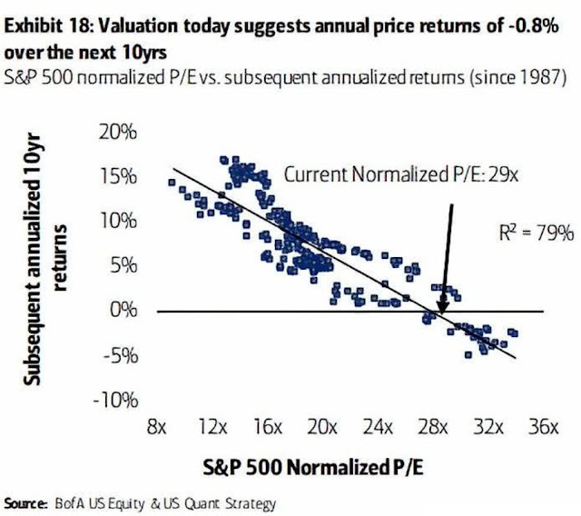
It would be much easier to plan for the future if we knew what stock prices were going to do. Bank of America has a chart with seemingly solid evidence that stocks will lose a total of about 8% over the next 10 years. I’m going to show why this evidence is nonsense. But don’t worry; I’ll do it without making you try to remember any of your high school math.
The Bank of America chart [shown on the left] looks intimidating to non-specialists, but I’ll summarize the relevant parts in easy-to-understand language. The basic idea is that for each month since 1987, they looked at how expensive stocks were that month and compared that to stock market returns over the 10 years following that month. They found that the more expensive stocks were, the lower the next decade of returns tended to be. The hope is that we can just use the chart to look up today’s stock prices to see what stock returns we’ll get over the next 10 years.
In the chart, each dot represents one month from 1987 to 2010. Notice that the dots are fairly close to forming a straight line. Statisticians get excited when they see a strong relationship like this. If the line were perfectly straight, we could just look up how pricey today’s stocks are (using a measure called the P/E or price-to-earnings ratio), and read off the average annual stock return we’ll get over the next 10 years.
The line isn’t perfectly straight, but it’s fairly close. One measure of how close to a straight line we have is called R-squared. For our purposes here, we don’t need to know much about R-squared other than 100% means a straight line, and as this percentage drops toward zero, the cloud of dots spreads out. The chart indicates an R-squared of 79%, which is a strong relationship.
Also indicated on the chart is the prediction that stocks will lose an average of about 0.8% each year over the next decade. However, if we imagine an oval surrounding the full range of dots, this chart predicts annual stock returns between about -3% and +2%. If we knew future stock returns really would fall in this range, most people would sell their stocks. But can we count on stock returns falling in this range? It turns out that we can’t because the chart is deeply flawed, as I’ll explain below.
Problems
The first thing to observe is that this chart is based on about 34 years of stock market data, a little over 3 decades. Because we’re talking about 10-years returns, you might wonder why there are more than 3 dots on the chart. The answer is that it uses overlapping periods. There is a dot for January 1987, then February 1987, and so on.
Consider the ten years of returns starting in January 1987 and compare this to the ten years of returns starting in February 1987. They are the same in 119 of 120 months. Each decade of returns starting monthly from 1987 to 2010 overlaps with 119 other decades. There is a huge amount of redundancy in the chart. Somehow we went from a 3-dot chart to one with hundreds of dots.
Using overlapping data isn’t always a bad thing, but it is in this case because there is just too little independent data to have any statistical significance. To show this, I ran some simulations. I created random stock market data and measured R-squared values.
The method I used for creating this simulated stock market data created returns that ignored stock valuations. This means that using P/E values to predict stock market returns is futile with this simulated data; the R-squared value of the underlying probability distribution used in the simulations is zero. To confirm this, I generated a million years of stock market data, and measured the R-squared value. In a thousand repetitions of this experiment, all R-squared values were less than 0.02%.
However, coincidences are common when you examine very small amounts of data. I ran simulations of 34 years of stock market data. I repeated this experiment 100 million times. Amazingly, in just over one-tenth of the simulations the R-squared value was above 79%, and in 51% of the simulations the R-squared was above 50%. These seemingly strong correlations are what you get with small amounts of random data, even though the underlying probability distribution has no correlation at all (R-squared equal to zero).
What can we conclude from these experiments?
The data in the Bank of America chart is a meaningless coincidence. In an earlier article I showed that when we examine stock market data back to 1936, the correlation becomes much weaker (the dots look more like a wide cloud). We can’t tell what will happen with stocks over the next 10 years with any accuracy just by looking at 34 years of stock returns, and it turns out that going back to 1936 doesn’t help much either.
Why was this error missed?
If this chart is so deeply flawed, why did Bank of America create it and why are so many people spreading it through social media as evidence that stocks will perform poorly? The answer is that few people are good at probability theory. Most people who use statistical methods professionally don’t understand the underlying probability theory well enough to use statistics safely. When we use statistical tools to process data, it’s very easy to lose sight of significant problems, such as having too little data.
All the Bank of America chart is saying is that when stocks were expensive around the year 2000, the market crashed, and now that stock prices are very high again, the stock market may crash again soon. Or it might not; it’s hard to tell. The statistics just take this simple idea and dress it up to seem more scientific than it is.
Is this chart a deliberate deception? Probably not. Hanlon’s razor applies here: “never attribute to malice that which is adequately explained by stupidity.” When people know just enough math to be dangerous, they often fool themselves first and fool others later.
Does this mean stocks will keep going up?
No. It just means we don’t know what will happen, and the Bank of America chart sheds almost no light on the question. There are good reasons to believe that a market crash and poor returns over the next decade are more likely today than when stock prices were lower. But this chart isn’t one of the good reasons.
Conclusion
The crystal ball for viewing future stock returns is still cloudy. We need to consider a wide range of possible market outcomes in our planning. It’s important to strike a balance between being positioned to benefit from a rosy future and being protected against a bleak future. With stock prices so high, I’ve chosen to shift my focus a little more toward protecting myself against poor market returns.
 Michael J. Wiener runs the web site Michael James on Money, where he looks for the right answers to personal finance and investing questions. He’s retired from work as a “math guy in high tech” and has been running his website since 2007. He’s a former mutual fund investor, former stock picker, now index investor. This blog originally appeared on his site on Sept. 16, 2021 and is republished on the Hub with his permission.