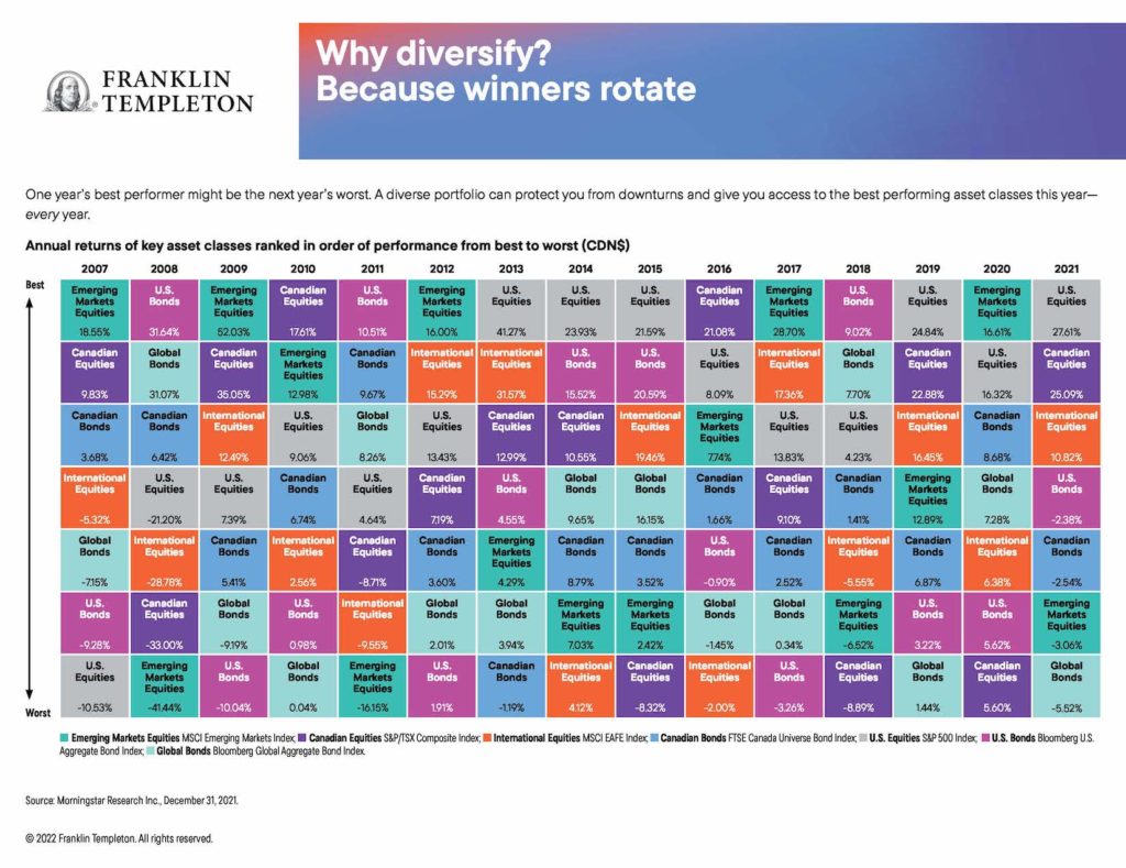
 My latest MoneySense Retired Money column addresses a topic I have regularly revisited over the years: annual charts that help investors visualize the top-performing (and bottom-performing!) asset classes. You can find the full column by clicking on the highlighted headline here: Reading the “Annual Returns of Key Asset Classes”—what it means for Canadian investors.
As the column notes, I always enjoyed perusing the annual asset classes rotate chart that investment giant Franklin Templeton used to distribute to financial advisors and media influencers. I still have the 2015 chart on my office wall, even though it’s years out of date.
Curious about the chart’s fate, I asked the company what had become of it, and learned it’s still available but now it’s only in digital format online. As always I find it enormously instructive. It’s still titled Why diversify? Asset classes rotate. As it goes on to explain, “one year’s best performer might be the next year’s worst. A diverse portfolio can protect your from downturns and give you access to the best performing asset classes this year – every year.”
The chart lists annual returns in Canadian dollars, based on various indexes.
Right off the top, you see that U.S. equities [the S&P500 index] are as often as not the top-producing single asset class. It topped the list five of the last nine years: from 2013 to 2015, then again in 2019 and 2021.
On the flip side, bonds tend to be the worst asset class. Over the 15 years between 2007 and 2021, at least one bond fund was at the bottom seven of those years: global bonds [as measured by the Bloomberg Global Aggregate Bond Index] in 2010, 2019 and 2021, US bonds [Bloomberg US. Aggregate Bond Index] in 2019, 2012 and 2017, and Canadian bonds [FTSE Canada Universe Bond index] in 2013. And consider that all those years were considered (in retrospect) a multi-decade bull market for bonds. You can imagine how bonds will look going forward now that interest rates have clearly bottomed and are slowly marching higher.
As you might expect, volatile asset classes like Emerging Markets [measured by the MSCI Emerging Markets index] tend to generate both outsized gains and outsized losses. EM topped the chart in five of the last 15 years (2007, 2009, 2012, 2017 and 2020) but were also at the bottom in 2008 and 2011. EM’s largest gain in that period was 52% in 2009, immediately following the 41% loss in 2008. Therein lies a tale!
The latest Templeton online charts also include a second version titled “Risk is more predictable than returns.” It notes that “Higher returns often come with higher risks. That’s why it’s important to look beyond returns when choosing a potential investment.” It ranks the asset classes from lower risk to higher risk and here the results are remarkably consistent across almost the entire 15-year time span between 2005 and 2021.
The missing alternative asset classes
This is all valuable information but alas, these charts seem to focus almost exclusively on the big two asset classes of stocks and bonds, precisely the two that are the focus of all those popular All-in-one Asset Allocation ETFs pioneered by Vanguard and soon matched by BMO, iShares, Horizons and a few others.
For me, the disappointment is that the Why diversify chart, like most of the AA ETFs, for some reason ignore alternative asset classes like gold or precious metals, real estate or REITs, commodities, inflation-linked bonds and cryptocurrencies. Refer to my earlier column this year on Ray Dalio’s All-Weather portfolio, which holds many of these. Interestingly, I see that Fidelity added 2 or 3% crypto exposure to its new Asset Allocation ETFs, depending on how aggressive a mix you pick.
As I said at the outset, there’s much investors can learn from charts like these, whether you’re starting out or well into Retirement.


