Tag Archives: bonds

Offence vs Defence

  • Ch-ch-ch-ch-changes
  • Turn and face the strange
  • Ch-ch-changes
  • Don’t want to be a richer man
  • Ch-ch-ch-ch-changes
  • Turn and face the strange
  • Ch-ch-changes
  • There’s gonna have to be a different man
  • Time may change me
  • But I can’t trace time — Changes, by David Bowie
Image courtesy Outcome/Shutterstock

By Noah Solomon

Special to Financial Independence Hub

There is a basic principle that most people follow when it comes to their spending decisions. In essence, people generally try to either

(1) Get the most they can for the least amount of money, or

(2) Spend the least amount of money on the things they want (i.e. get the best deal)

In other words, rational utility maximizers try to be as efficient as possible when parting with their hard-earned dollars.

Strangely, many investors abandon this principle when it comes to their portfolios. With investing, what you get is return (hopefully more than less), and what you pay (other than fees) is risk. People often focus on return without any regard for the amount of risk they are taking. Alternately, many make the mistake of reducing risk at any cost, regardless of the magnitude of potential returns they leave on the table.

The foundation of successful investing necessitates achieving an optimal balance between return and risk. Different types of assets (volatile speculative stocks, stable dividend paying stocks, bonds, etc.) have very different risk and return characteristics. Relatedly, a portfolio’s level of exposure to different asset classes is the primary determinant of its risk and return profile, including how efficient the balance is between the two.

Offense, Defense, & Bobby Knight

Robert Montgomery “Bobby” Knight was an American men’s college basketball coach. Nicknamed “the General,”h e won 902 NCAA Division I men’s basketball games, a record at the time of his retirement. He is quoted as saying:

“As coaches we talk about two things: offense and defense. There is a third phase we neglect, which is more important. It’s conversion from offense to defense and defense to offense.”

Nobody can escape the fact that you can’t have your cake and eat it too. You can’t increase potential returns without taking greater risk. Similarly, you can’t reduce the possibility of losses without reducing the potential for returns.

Picking up Pennies in Front of a Steamroller vs. Shooting Fish in a Barrel

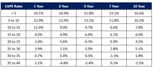
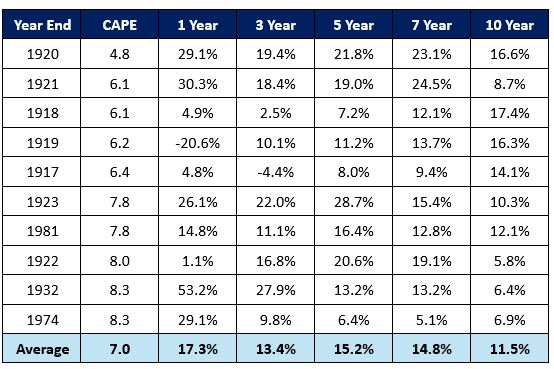
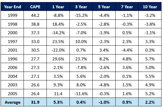
Notwithstanding this unfortunate tradeoff, there are times when investors should focus heavily on return on capital (i.e. being more aggressive), times when they should be more concerned with return of capital (i.e. being more defensive), and all points in between.

Sometimes, there is significantly more downside than upside from taking risk. Although it is still possible to reap decent returns in such environments, the odds aren’t in your favour. Reaching further out on the risk curve in such regimes is akin to picking up pennies in front of a steamroller:  the potential rewards are small relative to the possible consequences. At the other end of the spectrum, there are environments in which the probability of gains dwarfs the probability of losses. Although there is a relatively small chance that you could lose money in such circumstances, the wind is clearly at your back. At these junctures, dialing up your risk exposure is akin to shooting fish in a barrel – the likelihood of success is high while the risk of an adverse event is small.

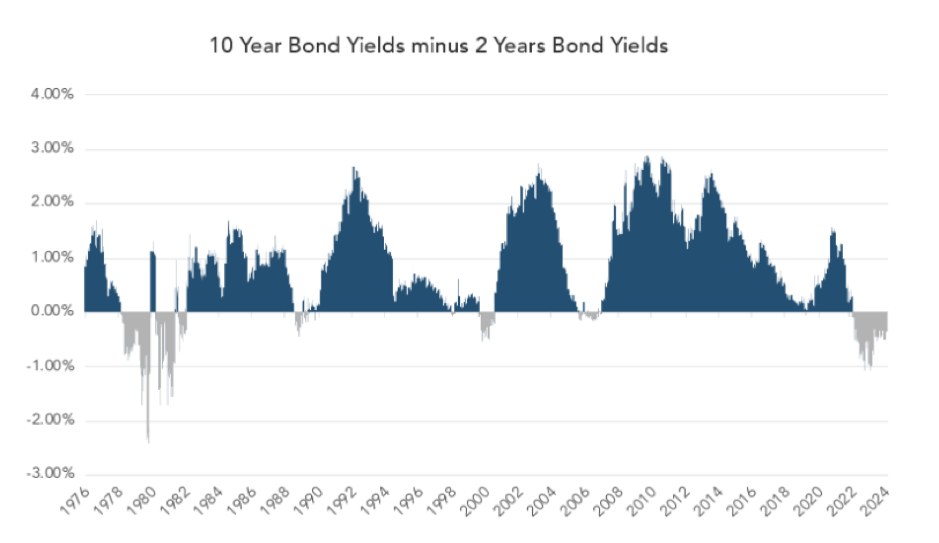
John F. Kennedy & the Chameleonic Nature of Markets

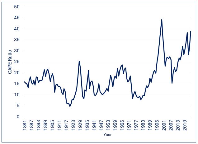
Former President John F. Kennedy asserted that “The one unchangeable certainty is that nothing is certain or unchangeable.” With regard to markets, the risk and return profiles of different asset classes are not stagnant. Rather, they change over time depending on a variety of factors, including interest rates, economic growth, inflation, valuations, etc.

Given this dynamic, it follows that determining your optimal asset mix is not a “one and done” treatise, but rather a dynamic process that takes into account changing conditions. Yesterday’s optimal portfolio may not look like today’s, which in turn may be significantly different than the one of the future.

It’s not just the risk vs. return profile of any given asset class that should inform its weight with portfolios, but also how it compares with those for other asset classes. As such, investors should use changing risk/return profiles among asset classes to “tilt” their portfolios, increasing the weights of certain types of investments while decreasing others.

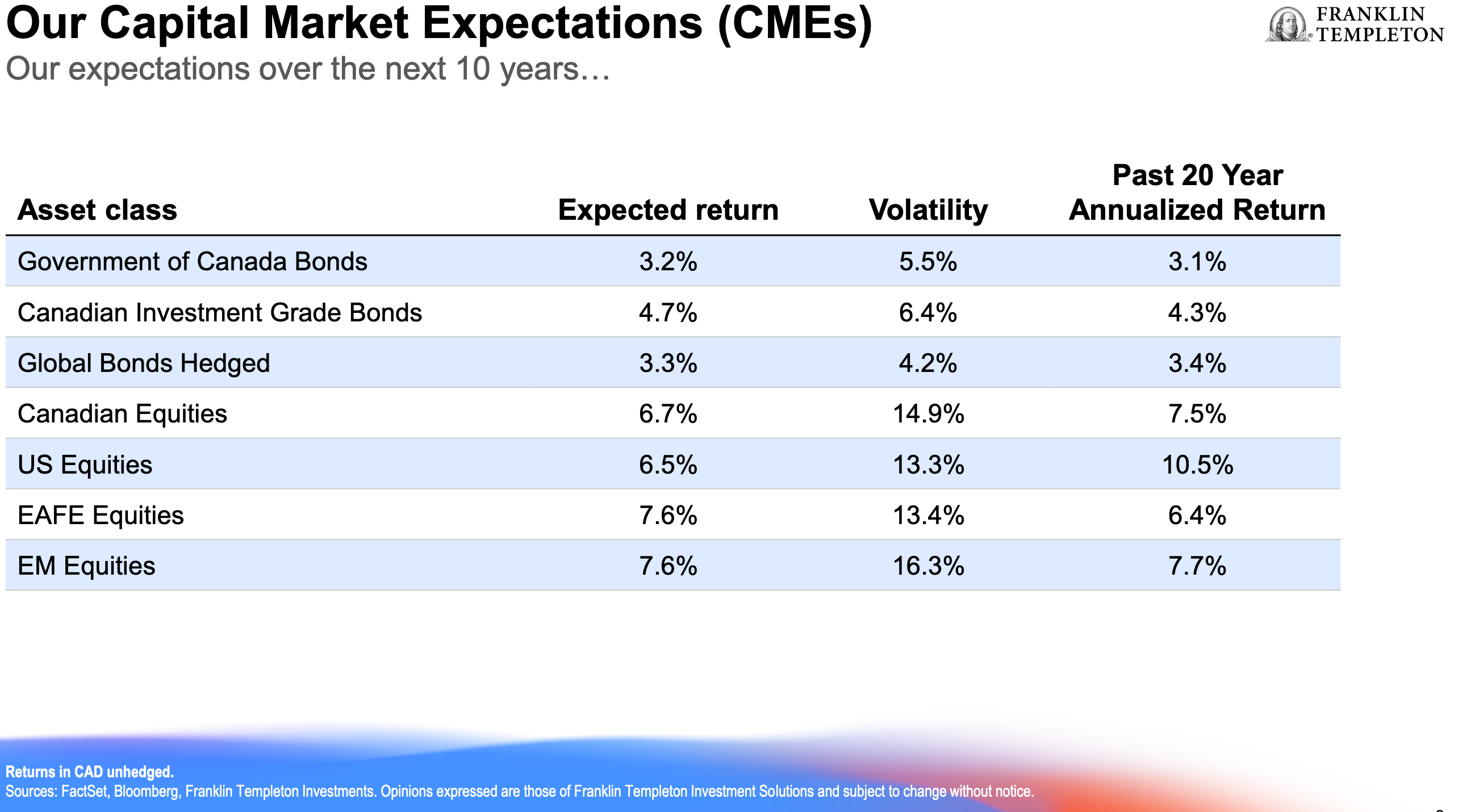
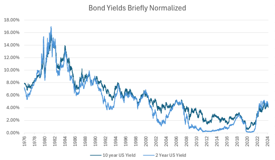
In “normal” times, the expected return from stocks exceeds the yields offered by cash and high-grade bonds by roughly 3% per annum. However, this difference can expand or contract depending on economic conditions and relative valuations among asset classes.

In the decade plus era following the global financial crisis, not only did rates remain at historically low levels, but the prospective returns on equities were abnormally high given the positive impact that low rates have on spending, earnings growth, and multiples. Against this backdrop, the prospective returns from stocks far exceeded yields on safe harbour investments. Under these conditions, it is no surprise that investors who had outsized exposure to stocks vs. bonds were handsomely rewarded.

Expected Return on Stocks vs. Yield on High Grade Bonds: Post GFC Era

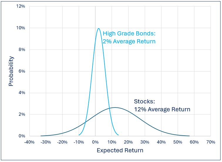
As things currently stand, the picture is markedly different. Following the most significant rate-hiking cycle in decades, bonds are once again “back in the game.” Moreover, lofty equity market valuations (at least in the U.S.) suggest that the S&P 500 Index will deliver below-average returns over the next several years. Continue Reading…

Be the House, not the Chump


Free public domain CC0 photo courtesy Outcome

By Noah Solomon

Special to Financial Independence Hub

I’m just sitting on a fence
You can say I got no sense
Trying to make up my mind
Really is too horrifying
So I’m sitting on a fence

  • The Rolling Stones


Benjamin Graham and David Dodd are universally regarded as the fathers of value investing. In their 1934 book “Security Analysis” they introduced the concept of comparing stock prices with earnings smoothed across multiple years. This long-term perspective dampens the effects of expansions as well as recessions. Yale Professor and Nobel Prize winner Robert Shiller later popularized Graham and Dodd’s approach with his own version, which is referred to as the cyclically adjusted price-to-earnings (CAPE) ratio.

S&P 500 CAPE Ratio: 1881- Present

Since 1881, the CAPE ratio for U.S. equities has spent about half of the time between 10 and 20, with an average and median value of about 16. Its all-time low of 5 occurred at the end of 1920, and its high point of 45 occurred at the end of 1999 during the height of the internet bubble.

What if I told you …. ?

The following table shows average real (after inflation) annualized returns following various CAPE ranges.

S&P 500 Index: CAPE Ratio Ranges vs. Average Annualized Future Returns (1881 Present)


What is abundantly clear is that higher returns have tended to follow lower CAPE ratios, while lower returns (or losses) have tended to follow elevated CAPE levels. An investment strategy that entailed having above average exposure to stocks when CAPE levels were low, below average equity exposure when CAPE levels were high, and average allocations to stocks when CAPE levels were neither elevated not depressed would have resulted in both less severe losses in bear markets and higher returns over the long-term.

By no means does this imply that low CAPE ratios are always followed by periods of strong performance, nor does it imply that poor results are guaranteed following instances of elevated CAPE levels. That would be too easy!

S&P 500 Index: Lowest CAPE Ratios vs. Future Real Returns (1881 – Present)   


S&P 500 Index: Highest CAPE Ratios vs. Future Real Returns (1881 – Present) 


Looking at the performance of stocks following extreme CAPE levels, it is clear that valuation is best used as a strategic guide rather than as a short-term timing tool. It is most useful on a time scale of several years rather than a shorter-term timing tool.

  • Although there have been instances where low CAPE levels have been followed by weak performance over the next 1-3 years, there have been no instances in which average annualized returns over the next 5-10 years have not been either average or above average. While it sometimes takes time for the proverbial party to get started when CAPE levels hit abnormally depressed levels, markets have without exception performed admirably over the medium to long-term.
  • Similarly, although there have been instances where high CAPE levels have been followed by strong performance over the next 1-3 years, there have been no instances in which average annualized returns over the next 5-10 years have not been either below average or negative. Whenever CAPE levels have been extremely elevated, it has only been a matter of time before the valuation reaper exacted its toll on markets. This brings to mind the following quote from Buffett:

“After a heady experience of that kind, normally sensible people drift into behavior akin to that of Cinderella at the ball. They know that overstaying the festivities — that is, continuing to speculate in companies that have gigantic valuations relative to the cash they are likely to generate in the future — will eventually bring on pumpkins and mice. But they nevertheless hate to miss a single minute of what is one helluva party. Therefore, the giddy participants all plan to leave just seconds before midnight. There’s a problem, though: They are dancing in a room in which the clocks have no hands.”

Be the House, Not the Chump

There have been (and inevitably will be) times when equities post strong returns for a limited time following elevated CAPE levels and instances where stocks post temporarily weak results following depressed CAPE levels.

However, successful investing is largely about playing the odds. If you were at a casino, wouldn’t you prefer to be the house rather than the chump on the other side of the table? Although chumps occasionally get lucky, this doesn’t change the fact that the odds aren’t in their favour and that they are playing a losing game. Over the long-term, investors who refrain from reducing their equity exposure when CAPE levels are elevated and don’t increase their allocations to stocks when CAPE levels are depressed will achieve satisfactory returns over extended periods. That being said, I sure wouldn’t recommend such a static approach for the simple reason that it involves suffering severe setbacks in bear markets and leaving a lot of money on the table over the long-term.

Given the historically powerful relationship between starting CAPE levels and subsequent returns, what if I told you that the CAPE ratio currently stands at 38, putting it at the top 98th percentile of all year-end observations going back over 150 years, and the top 96th percentile over the past 50 years? Presumably you would at the very least consider taking a more cautious stance on U.S. stocks.

Let’s Pretend ….

Let’s pretend that you knew nothing about the historical relationship between CAPE levels and subsequent returns.  A combination of behavioural biases, speculative fervour, and FOMO (fear of missing out) might lead you to adopt an “if it isn’t broken, don’t fix it” stance of inertia.

Recency bias can give people a false sense of confidence that what has occurred in the recent past is “normal” and is therefore likely to continue in the future. Moreover, the strong returns which have occurred since the global financial crisis can exacerbate FOMO, thereby prompting investors to stay at the party (and perhaps even to imbibe more intensely by increasing their equity exposure). Lastly, the potential of innovative technologies such as AI to revolutionize businesses can capture investors’ imaginations and incite euphoria to the point where they believe that there is no price that is too high to pay for the unlimited profit potential of the “shiny new toy.”

Standing at the Crossroads

So here we stand at a crossroads, caught between the weight of history and the possibility that this time it may truly be different. What is an investor to do? One can never be 100% sure. The “right” answer will only be known in hindsight once it becomes a matter of record, at which point it will be too late for investors who get caught on the wrong side of the fence. Continue Reading…

Franklin Templeton 2025-2035 Outlook: Stocks will beat bonds, EAFE/EM may edge out North American stocks

Stocks are expected to outperform bonds over the next 10 years but EAFE and Emerging Markets will probably do a little better than U.S. and Canadian equities, portfolio managers for Franklin Templeton Investment Solutions told advisors and the media in its 2025 Outlook session held Thursday in Toronto. The twice-annual economic outlook marks the 70th year that Franklin Templeton has operated in Canada: Sir John Templeton’s famous Templeton Growth Fund was launched in Canada in 1954. It has been in the U.S. more than 75 years.

Senior Vice President and Portfolio Manager Ian Riach [pictured left] said in a presentation distributed to attendees that “expected returns for fixed income have become slightly less attractive as yields have moved lower over the past year. EAFE and Emerging market equities [are] expected to outperform U.S and Canadian equities.” The most likely path to stable returns will be through “a diversified and dynamic approach,” he said.

Shorter-term Macro themes

Addressing major shorter-term themes, Riach said the United States continues to lead in Growth, while Canada is improving and the rest of the world is “challenged.” Inflation continues to trend down but some areas are faster than others. Fiscal policy “remains supportive” while “central banks remain data dependent.”

Addressing Canadian economic growth, Riach said Canada’s  inflation backdrop “continues to surprise to the downside” and is now at target levels as leading indicators continue to improve from weak levels. Thus far, Canadians holding mortgages have not yet been impacted by higher interest rates, based on the cumulative share of mortgages outstanding in February 2022 that have been subject to a payment increase.

Economic Growth in Europe and Asia. 

European sentiment is improving but remains at weak levels while Asian manufacturing “has started to fall,” he said. Economic growth in China remains weak: “Consumer sentiment has yet to recover from deteriorating property sector and labor market imbalances.”

Addressing Emerging Markets ex China, Riach said weakening leading manufacturing indicators will “challenge upside potential of cyclical regions broadly.”

In the United States, AI-related stocks (Artificial Intelligence) continue to power U.S. earnings growth expectations. However, Riach said, “this has been broadening to the ‘forgotten 493’ somewhat.” (i.e. away from the Mag 7.)


Inflation much improved

Worldwide, inflation is much improved and is now below Central Bank targets, Riach said.


Asset Allocation

Moving to recommended portfolio positioning, Franklin Templeton is overweight equities, underweight bonds and neutral on Cash. Within stocks, it is overweight Canadian and U.S. equities, Underweight EAFE (Europe Australasia and Far East) and Neutral on Emerging Markets.

The second major presentation was delivered by Jeff Schulze, Head of Economic and Market Strategy for Franklin Templeton’s ClearBridge Investments. Schulze [pictured on right] is known for his “Anatomy of a Recession” analytical work, which assesses 12 variables that historically foreshadow recession.

However, as the chart below shows, the recession dashboard is currently signalling expansion rather than recession:


Addressing employment, Schulze said that while the pace of job creation has slowed substantially over the past few years, “it has settled in line with the pace experienced during the previous economic expansion.” As a result, U.S. consumer spending is robust.
Continue Reading…

Bonds: The Comeback Kid


Image by Shutterstock, courtesy of Outcome

By Noah Solomon

Special to Financial Independence Hub

A change, it had to come
We knew it all along
We were liberated from the fold, that’s all
And the world looks just the same

And history ain’t changed
‘Cause the banners, they all flown in the last war

Won’t Get Fooled Again. The Who;  © Abkco Music Inc., Spirit Music Group


As inflation rapidly accelerated towards the end of 2021, bond yields woke up from their decade plus slumber breathing fire and brimstone. Subsequently, bonds have once again become a worthwhile asset class for the first time since the global financial crisis.

I will explore the historical behaviour and characteristics of bonds. Importantly, I will also discuss how they have reclaimed some of their status as a valuable part of investors’ portfolios.

Riding the Roller-Coaster for the Long Term

Notwithstanding that stocks have periodically caused investors some severe nausea during bear markets, those who have been willing to tolerate such dizzy spells have been well-compensated. In Stocks for the Long Run, Wharton Professor Jeremy Siegel states “over long periods of time, the returns on equities not only surpassed those of all other financial assets but were far safer and more predictable than bond returns when inflation was taken into account.”

As the following table demonstrates, not only have stocks outperformed bonds, but have also trounced other major asset classes. The effect of this outperformance cannot be understated in terms of its contribution to cumulative returns over the long term. Over extended holding periods, any diversification away from stocks has resulted in vastly inferior performance.

Real Returns: Stocks, Bonds, Bills, Gold and the U.S. Dollar: 1802-2012

With respect to stocks’ main competitor, which are bonds, Warren Buffett stated in his 2012 annual letter to Berkshire Hathaway shareholders:“Bonds are among the most dangerous of assets. Over the past century these instruments have destroyed the purchasing power of investors in many countries, even as these holders continued to receive timely payments of interest and principal … Right now, bonds should come with a warning label.”

The Case for Bonds

Notwithstanding that past performance is not a guarantee of future returns, the preceding table begs the question of why investors don’t simply hold all-stock portfolios. However, there are valid reasons, both psychological and financial, that render such a strategy less than ideal for many people.

The buy-and-hold, 100% stock portfolio is a double-edged sword. If (1) you can stick with it through stomach-churning bear market losses, and (2) have a long-term horizon during which the need to liquidate assets will not arise, then strapping yourself into the roller-coaster of an all-stock portfolio may indeed be the optimal solution. Conversely, it would be difficult to identify a worse alternative for those who do not meet these criteria. Continue Reading…

How a Fed Rate Cut could bolster Canada’s largest Covered Call Bond ETFs


By Ambrose O’Callaghan, Harvest ETFs

(Sponsor Blog) 

In late August, Federal Reserve chairman Jerome Powell caused a stir among the investing community when he provided the strongest signal yet that the U.S. central bank is gearing up for interest rate cuts starting in September.

At the time of this writing, we are just one day away from that crucial decision. So what will this mean for  the yield curve, the direction of the Fed, how the change in policy is affecting markets, and the implications for Harvest Premium Yield Treasury ETF (HPYT:TSX) and the Harvest Premium Yield 7-10 Year Treasury ETF (HPYM:TSX) in the final third of 2024. Let’s explore!

How does the yield curve function?

The yield curve, which is a representation of different bond yields across various maturities, can take varying shapes and curvatures. However, the most talked about is the shape of the yield curve in particularly one that’s either normal or inverted. A normal yield curve will have short-term bond yields that are lower than long-term bond yields. This encapsulates the time and risk premium associated with investing further into the future. However, in a period wherein central banks are seeking to slow economic growth/inflation, near-term rates will be raised in a manner that leads to higher short-term yields versus long-term yields. This is called an inverted yield curve, a much rarer occurrence.

Source:  Bloomberg, Harvest Portfolios Group Inc., September 12, 2024

In practice, the difference between the 10-year yield versus the 2-year yield of government bonds is the go-to measure or gauge. The yield curve has been inverted for some time and became dis-inverted (Normal) in August 2024. That is a sign that shorter-term rates are coming down. This likely precedes meaningful interest rate cuts.

Source:  Bloomberg, Harvest Portfolios Group Inc., September 12, 2024

What drives the Federal Reserve?

The Federal Reserve (Fed) has a dual mandate: to achieve maximum employment, and to keep prices stable. Despite taking on one of its most aggressive interest rate hiking cycles in history to regain price stability, inflation has failed to return to the target of 2%, albeit subsiding in recent months. The lower levels of inflation come with slowing economic data and weaker-than-expected jobs data, which belies the Fed’s goal of achieving maximum employment. So, what’s next?

With inflation coming down, the Fed members seem ready to cut short-term rates to alleviate the negative impact of higher interest rates on the economy. But before we get excited, it’s worth noting that the Central bank tools traditionally take time to filter through to the economy. Interest rate cuts may not have an immediate impact on the economy and broader markets but will filter over time.

Ultimately, this shift in policy should return the inverted yield curve to a normal yield curve.

Rate expectations: What is already priced in?

The next Fed rate announcement meeting is on September 18, and the market is already pricing in the first rate cut. The size of the cut is still up for debate, but it is likely to be 25 basis points, with a smaller chance that it could be larger at 50 basis points.

Looking further out to the Fed’s remaining two meetings for the rest of the year, the market expects the Fed to cut rates again. That would represent a total of 100 basis points of cuts expected by the end of 2024. Moreover, the market has priced in 10 rate cuts, or 250 basis points, of total interest rate cuts. These are priced in and expected to occur throughout 2025 with the ultimate destination of 3.00% on the overnight rate.

However, interest rates further out the yield curve have also recently moved down quite a bit. This is what’s known in bond-speak as a “bull steepening” — as the curve normalizes yields across maturities shift lower too, and thus bond prices move higher. Indeed, the narrative continues to shift toward the imminent start of this rate cutting cycle.

The 10-year yield was 3.65% at the time of writing. That is already down significantly – 137 basis points – from the peak of interest rates in October 2023.

The implications for the yield curve

What will happen to the yield curve going forward? Portfolio Manager Mike Dragosits, CFA, expects the yield curve to normalize due to several existing factors. The tightening cycle is ending, and the Fed is poised to embark on a rate-cutting cycle. So, this would mean that short-term bond yields may fall faster and stay relatively lower than long-term bond yields. Continue Reading…