By Noah Solomon
Special to Financial Independence Hub

Well, I won’t back down
No, I won’t back down
You could stand me up at the gates of Hell
But I won’t back down
No, I’ll stand my ground
Won’t be turned around
And I’ll keep this world from draggin’ me down
Gonna stand my ground
And I won’t back down
- I won’t Back Down, by Tom Petty
It is well understood that people with a lower tolerance for risk must accept lower returns than those who have a greater tolerance. By the same token, investors who are willing to bear more risk can expect to reap higher returns than their more conservative peers.
However, this does not change the fact that any rational person, regardless of their tolerance for risk, would prefer higher rather than lower returns given the amount of risk they are willing to take. Similarly, they would prefer to experience lower rather than higher volatility given their target rate of return.
These self-evident truths beg the following question: For any given level of risk tolerance, what is the optimal path to achieving higher returns? In this month’s missive, I will explore various paths to accomplishing this objective, including their respective strengths and weaknesses.
Live by the Sword, Die by the Sword
If managers try to outperform their benchmarks then by definition they must hold portfolios which are different than their benchmarks, either in terms of its individual assets, their respective weightings within the portfolio, or both.
However, holding a portfolio which differs from its benchmark constitutes the proverbial double-edged sword. The pursuit of great performance can just as easily be wrong or right. If you strive for performance which is far better than the norm, you must hold a portfolio that exposes you to the risk of being far worse. Moreover, over the long term, it is highly likely that you will assume both roles in equal proportion or worse.
The long-term effects of oscillating between strong outperformance and strong underperformance are illustrated in the table below, which incorporates the following data:
- Monthly returns for the TSX Dividend Aristocrats Index ETF (the benchmark that S&P Global uses to evaluate dividend-focused Canadian equity funds) going back to 2008, which is the first full calendar year of the fund’s existence.
- Monthly returns over the same period for an “Alternator Fund” which switches every twelve months between underperforming the index by 5% and outperforming it by 5%.
Benchmark Portfolio vs. Alternator Fund: 2008-2025
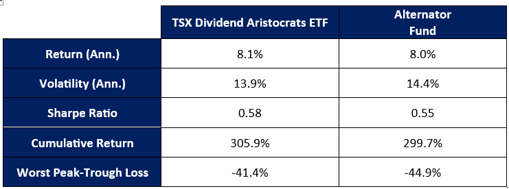
A symmetrical combination of well above and below average returns produces a long-term record that is characterized by slightly lower returns, higher volatility, and larger losses in challenging markets. The punchline is that managers who strive to consistently outperform by a substantial margin every year are highly likely to deliver subpar results over the long-term.
Slow and Steady Wins the Race
Legendary investor Howard Marks once recalled a discussion he had in 1990 with the director of a major mid-West pension plan. During the conversation, he learned that the plan’s stock portfolio had far outperformed the S&P 500 Index over the past 14 years. Even more striking than its headline performance was the path that it had followed to achieve it.
Notwithstanding that the plan’s returns in any given year had never placed below the 47th percentile or above the 27th percentile, its portfolio’s performance over the entire fourteen-year period placed it in the 4th percentile.
The proverbial moral of the story is that if you swing for the fences and attempt to be in the top 5% or 10% every year, you will fall victim to the double-edged sword, delivering long-term returns that are (at best) mediocre and that are accompanied by high volatility. By contrast, if you deliver performance that is slightly above average on a realistically consistent basis with particular emphasis on outperforming in bear markets, (1) your long-term outperformance will be substantially better than average, and (2) you will be subject to lower volatility and shallower losses in challenging markets.
Munger’s Inversion and the “When” of Outperformance
The late great Charlie Munger, investment guru and longtime Buffett partner, stated, “Invert, always invert.” This statement describes his inclination for taking a given scenario and reversing it to evaluate the ramifications of the opposite scenario. Munger used this approach, which spotlights what to avoid rather than what to seek, to solve complex problems.
Outperformance not only stems from how often and by how much you outperform or underperform, but when you do so. With respect to long-term compounding and wealth creation, it is far more important to outperform in bad times than in good times. Continue Reading…