Tag Archives: cash

Why Retirees own cash, bonds & GICs


By Dale Roberts

Special to Financial Independence Hub

Imagine retiring, and then you have to head back to work, or you cancel your planned trips and greatly curtail your lifestyle. That’s what happened to too many who retired at or near the recesssions created by the dot com crash and the financial crisis. Risk in retirement is perhaps the flipside of risk in the accumulation stage. In the accumulation stage, lower stock prices can be very good. Lower prices in retirement can impair retirement. The equity risk in retirement is called sequence of returns risk. Poor stock market returns early in retirement can create a situation where the portfolio value has decreased, and selling more shares at lower prices might be hazardous to your retirement health. That’s why retirees own bonds, cash and GICs.

I will start off with a few charts that demonstrate the path of a retiree’s portfolio who retired at the start of the dot com crash (late 90s) and the financial crisis (2007-2009).

Here’s the drawdown history in recessions using the U.S. market as an example.

Yes, two of the most recent major corrections were epic and extraordinary. In the dot com crash and the financial crisis, stock markets were down 50%. In the early 2000s U.S. stock markets were down 3 years in a row.

The “average” decline in a recession is close to 25%. But as we know, average rarely happens when it comes to investing and stock markets.

The dot com crash retirement scenario

In the following scenario the retiree has a  C$1,000,000 portfolio and spends 4.2% of the portfolio value in year one. The $1,000,000 creates $42,000 of income. The spending rate then increases, adjusted for inflation. If inflation is 3%, the retiree gets a 3% raise.

The portfolio is 50% U.S. stocks and 50% global.

Portfolio Visualizer

We can see that it was “over” quickly for the equity portfolio in this scenario. Even the strong market returns from 2003 to 2008 could not bring the portfolio back to health. In late 2007 the portfolio value was $870,000 but the spend rate would have been considerable. We have a portfolio value much lower than $1,000,000 and the amount taken out of the portfolio has increased at the rate of inflation. It is a dead portfolio walking, even in 2007. The financial crisis essentially finished it off, and was limping through the 2010s. 2024 would be its final year.

Unfortunate start date

The retiree was a victim of bad luck. They strolled into a very unfortunate start date – at the beginning of a recession and a severe stock market correction.

Let’s head back two years to see what happens to a retiree who retired in 1998.

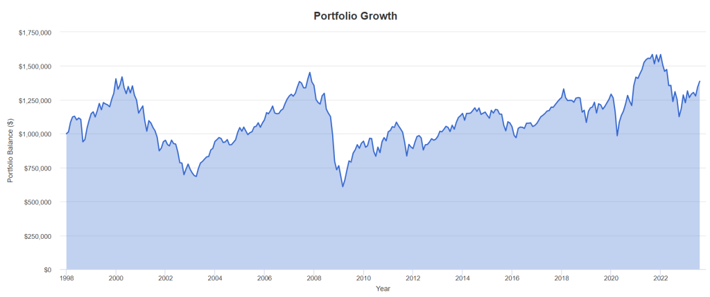
What a difference two years makes. That said, I would suggest that the portfolio was impaired in 2003 and 2008. It was outrageous stock market gains that brought the portfolio back to the land of the living. There is no guarantee that after 40% and 50% portfolio declines that 30% and 20% annual stock market gains will ride to the rescue.

It’s also likely that a retiree who has watched 30% to 40% of their portfolio value disappear is not comfortable keeping up the spend rate. They have cancelled trips, dinners, gifting and more. They might have self-imposed retirement withdrawal.

Risk is different and feels different in retirement.

That self-imposed retirement withdrawal may have occurred during the financial crisis as well.

Who is going to keep the spend rate when the portfolio is down over 50%? I’d suggest no one. And I’d count that as a retirement failure, having to change your retirement plans.

Are you feeling lucky?

Now, let’s give the retiree a very fortunate start date. 1991.

The portfolio never sees new lows. And obvioulsy, the retiree could have treated themself to a much higher spend rate of 4.2% inflation-adjusted. That’s called a variable withdrawal strategy. You spend more when times are very good. And you spend less during recessions. More on that later. Continue Reading…

The great migration to Cash: Money Market and Short-Term Fixed Income

Image from Pixabay: Alexander Lesnitsky

By Matt Montemurro, CFA, MBA, BMO ETFs

(Sponsor Content)

One of the biggest trends in the market, thus far in 2023, has been the flurry of inflows ($AUM) into money market and short-term fixed income. We have seen a “great migration to cash” as investors are literally being paid, handsomely, to park cash on the sidelines. We are now 6 months through the year and flows into the short end do not seem to be slowing down. Thus far YTD, we have seen $5.7bln flow into money market and ultra short-term fixed income ETFs, accounting for over 50% of all flows into fixed income ETFs in 2023 (Source: NBCFM ETF).

Money Market and Ultra Short-Term Fixed Income:  after years of being a forgotten segment of the market, how and why are they the leading asset gatherer?

With the accelerated path of rising rates, we have seen in the short end of the yield curve; (the overnight rate) the yield curve inverted. An inversion of the yield curve is caused when shorter-term rates rise faster than longer-term rates. Generally, this is something that occurs but reverses quite quickly.

Not this time. We are currently in a period of a prolonged yield curve inversion, which could be a leading indicator of economic weakness to come. This inversion is exactly what these money market and ultra short-term fixed income investors are looking to cash in on. Lock in higher shorter-term rates and take advantage of the inverted yield curve.

For too long, investors were forced to move outside of investment grade bonds and further out the yield curve to achieve their yield and return expectations. The market has shifted that paradigm on its head and allowed investors to truly get paid to wait on the sidelines in cash.

 Current Canadian Yield Curve

Source: Bloomberg, June 30, 2023

The short end appears to be the sweet spot for many investors, in terms of risk and reward.

Risk: by targeting the short end of the curve, investors will be minimizing their interest rate sensitivity (Duration exposure) and will generally be buying bonds that will be maturing in less than 1 year. Buying investment grade bonds, issued by high quality issuers, this close to maturity provides investors with downside protection as all these bonds will mature at par.[1]

Reward: Achieve a higher yield to maturity than further out the curve. Allowing investors to earn higher yields for lower interest rate sensitivity risk. The current market isn’t paying investors to lend money for longer periods. The front end provides an extremely attractive proposition for investors.

Today’s market is uniquely positioned and many market participants expect volatility to be on the horizon and as higher interest rates make their way through the economy, potentially causing growth to slowdown. Money market and short-term fixed income are well positioned for this environment, as investors can weather the potential volatility in the market while still meeting income and return needs. Continue Reading…

Violating my Principles

By Noah Solomon

Special to Financial Independence Hub

As I have written in the past, predicting stock market returns is largely an exercise in futility. Over the past several decades, the forecasted returns for the S&P 500 Index provided by Wall Street analysts have been slightly less accurate than someone who would have merely predicted each year that stocks would deliver their long-term average return. Importantly, not one major Wall St. strategist predicted either the tech wreck of the early 2000s or the global financial crisis of 2008-9.

To be clear, I am still adamant that consistently accurate forecasts are beyond the reach of mere mortals (or even quant geeks like me). Any investor who could achieve this feat would reap returns that put Buffett’s to shame. However, there may be some hope on the horizon. Good is not the enemy of great. The objective of any investment process should not be perfection, but rather to make its adherents better off than they would be in its absence.

To this end, I have decided to sin a little and model some of the most commonly cited macroeconomic variables that influence stocks market returns, with the objective of (1) ascertaining whether and how these factors have historically influenced markets and (2) what these variables are signaling for the future.

Don’t Fight the Fed

It is often stated that one shouldn’t fight the Fed. Historically, there has been an inverse relationship between changes in Fed policy and stock prices. All else being equal, increases in the Fed Funds rate have been a headwind for stocks while rate cuts have provided a tailwind.

Prior 1-Year Change in Fed Funds Rate vs. 1-Year Real Returns: S&P 500 Index (1960-Present)

As the preceding table illustrates, the difference in one-year real returns following instances when the Fed has been pursuing tighter monetary conditions has on average been 6.6%, as compared to 10.6% following periods when it has been in stimulus mode.

As of the end of June, the Fed increased its policy rate by 3.5% over the past 12 months. From a historical perspective, this change in stance lies within the top 5% of one-year policy moves since 1960 and is the single largest 12-month increase since the early 1980s. Given the historical tendency for stocks to struggle following such developments, this dramatic increase in rates is cause for concern.

Valuation, Voting, and Weighing

Over the past several decades, valuations have exhibited an inverse relationship to future equity market returns. Below-average P/E ratios have generally preceded above-average returns for stocks, while lofty P/E ratios have on average foreshadowed either below-average returns or outright losses.

Trailing P/E Ratio vs. 1-Year Real Returns: S&P 500 Index (1960-Present)

Since 1960, when P/E ratios stood in the bottom quintile of their historical range, the S&P 500 produced an average real return over the next 12 months of 9.4% compared with only 6.9% when valuations stood in the highest quintile. Sky high multiples have proven particularly poisonous, as indicated by the crushing bear market which followed the record valuations at the beginning of 2000.

To be clear, valuations have little bearing on the performance of stocks over the short term. However, their ability to predict returns over longer holding periods has been more pronounced. As Buffett stated, “In the short run, the market is a voting machine but in the long run, it is a weighing machine.”

Although valuations are currently nowhere near the nosebleed levels of the tech bubble of the late 1990s, they are nonetheless elevated. With a trailing P/E ratio hovering north of 21, the S&P 500’s valuation currently stands in the 84th percentile of all observations going back to 1960 and is at the very least not a ringing endorsement for strong equity market returns.

From TINA To TARA To TIAGA

At any given point in time, stock market valuations must be considered in the context of the yields offered by high quality money market instruments and bonds. The difference between the earnings yield on stocks and interest rates has historically been positively correlated to future market returns.

Earnings Yields Minus Fed Funds Rate vs. 1-Year Real Returns: S&P 500 Index (1960-Present)

When the difference between earnings yields and the Fed Funds rate has stood in the top quintile of its historical range, the real return of the S&P 500 Index over the ensuing 12 months has averaged 8.7% versus only 2.2% following times when it has stood in the bottom quintile.

Until the Fed began to aggressively raise rates in early 2022, TINA (there is no alternative) was an oft-cited reason for overweighting stocks within portfolios. Yields on bank deposits and high-quality bonds yielded little to nothing, thereby spurring investors to reach out the risk curve and increase their equity allocations.

As the Fed continued to raise rates, increasingly higher yields made money markets and bonds look at least somewhat attractive for the first time in years, thereby causing market psychology to shift from TINA to TARA (there are reasonable alternatives). Continue Reading…

Do you really need an Emergency Fund?

Photo by Mark König on Unsplash

By Anita Bruinsma, CFA

Clarity Personal Finance

One of the most agreed-upon financial planning concepts is the importance of an emergency fund. Having quick access to money to pay for an unexpected expense or job loss can prevent unwanted credit card debt and can lower stress levels.

Not everyone is on board though. Some people feel that keeping money in cash instead of investing it means you’re sacrificing too much potential growth. This might be a particularly true for people who are targeting financial freedom. Since investing is an important component of reaching financial goals, it’s understandable that you don’t want to drag down your overall rate of return by holding cash.

Having access to money for unexpected expenses, though, is important for pretty much everyone. So do you need an emergency fund and if you do, how much should it be?

Do you need an emergency fund?

If you have a home equity line of credit (HELOC), you might not need funds sitting in a savings account. Whether it’s a good idea to depend on your HELOC as an emergency fund depends on two main factors: if you had to borrow from it, how long would it take you to pay if off and what is the rate of interest you’re paying?

Generally, as long as the rate of interest on the line of credit is below what you could expect to earn in the stock market, and assuming you’re able to pay down the line of credit within a reasonable time period, then using your line of credit isn’t a bad idea. The key is to make sure you are disciplined in paying down the line of credit quickly, otherwise the interest cost will outweigh what you could earn in the market.

How much do you need?

For those who don’t have a HELOC or who prefer to have a safety net in cash, determining the right amount of money to keep in an easy-to-access, low-return account is important.

There are really two kinds of emergency funds: one that will pay your expenses if you lose your job or can’t work for a period of time, and one that will pay for the large, unpredictable expenses that crop up in everyday life.

The job loss emergency fund

Job loss can mean you were laid off or that you can’t work due to illness, an accident, or a personal/family crisis. You might have heard the standard advice that says you need 3-6 months’ worth of living expense to protect against a job loss. Like all personal finance shortcuts, this isn’t necessarily helpful. How much you need in an emergency fund is highly dependent on your situation.

Here are the main factors that influence how much you should have set aside in your job loss emergency fund:

  1. Do you have job stability? If your industry is known for sudden layoffs or if your role might be considered non-essential to an organization, you have a higher risk of losing your job and it might take you longer to find a new one. It would be wise to have a bigger cushion than someone who works in a stable industry or performs an essential role.
  1. Do you have disability insurance? If you have an accident or get really sick, you’ll receive some kind of payment while you have to take time off work. It won’t necessarily be enough but it will help and you’ll need a smaller emergency fund. If you expect to receive no pay if you need to take time off work, you need a bigger emergency fund.  
  1. What kind of lifestyle do you want to maintain? If you are laid off, you’ll need to pare back your spending. But to what extent? What do you consider to be “essential”? Are the kids’ swimming lessons essential? What about your gym membership? Understanding what essential means to you will help you decide how much to set aside.
  1. Do you have a partner or spouse? If you have a partner or spouse with whom you share the financial responsibilities of running a household and they are employed, would they be able to cover the essentials if you lost your job? How would your lifestyle be impacted? What is their job stability like? Do they work in the same industry as you do? If so, there might be a higher risk of both of you being laid off at the same time.
  1. Do you have savings in a TFSA or a non-registered account? If all of your money is in RRSPs or your pension, you don’t have any good options for withdrawing money in an emergency. However, you could choose to rely on your TFSA or non-registered funds for a portion of your needs.

The large expense emergency fund

For your large expense emergency fund, the amount you want to have available depends on how many opportunities for unexpected expenses you are exposed to and what other resources you could draw on. Continue Reading…

Retired Money: What Asset Class charts can teach about risk and volatility

My latest MoneySense Retired Money column addresses a topic I have regularly revisited over the years: annual charts that help investors visualize the top-performing (and bottom-performing!) asset classes. You can find the full column by clicking on the highlighted headline here: Reading the “Annual Returns of Key Asset Classes”—what it means for Canadian investors. 

As the column notes, I always enjoyed perusing the annual asset classes rotate chart that investment giant Franklin Templeton used to distribute to financial advisors and media influencers. I still have the 2015 chart on my office wall, even though it’s years out of date.

Curious about the chart’s fate, I asked the company what had become of it, and learned it’s still available but now it’s only in digital format online. As always I find it enormously instructive. It’s still titled Why diversify? Asset classes rotate. As it goes on to explain, “one year’s best performer might be the next year’s worst. A diverse portfolio can protect your from downturns and give you access to the best performing asset classes this year – every year.”

The chart lists annual returns in Canadian dollars, based on various indexes.

Right off the top, you see that U.S. equities [the S&P500 index] are as often as not the top-producing single asset class. It topped the list five of the last nine years: from 2013 to 2015, then again in 2019 and 2021.

On the flip side, bonds tend to be the worst asset class. Over the 15 years between 2007 and 2021, at least one bond fund was at the bottom seven of those years: global bonds [as measured by the Bloomberg Global Aggregate Bond Index] in 2010, 2019 and 2021, US bonds [Bloomberg US. Aggregate Bond Index] in 2019, 2012 and 2017, and Canadian bonds [FTSE Canada Universe Bond index] in 2013. And consider that all those years were considered (in retrospect) a multi-decade bull market for bonds. You can imagine how bonds will look going forward now that interest rates have clearly bottomed and are slowly marching higher.

As you might expect, volatile asset classes like Emerging Markets [measured by the MSCI Emerging Markets index] tend to generate both outsized gains and outsized losses. EM topped the chart in five of the last 15 years (2007, 2009, 2012, 2017 and 2020) but were also at the bottom in 2008 and 2011. EM’s largest gain in that period was 52% in 2009, immediately following the 41% loss in 2008. Therein lies a tale!

The latest Templeton online charts also include a second version titled “Risk is more predictable than returns.” It notes that “Higher returns often come with higher risks. That’s why it’s important to look beyond returns when choosing a potential investment.” It ranks the asset classes from lower risk to higher risk and here the results are remarkably consistent across almost the entire 15-year time span between 2005 and 2021.

The missing alternative asset classes

This is all valuable information but alas, these charts seem to focus almost exclusively on the big two asset classes of stocks and bonds, precisely the two that are the focus of all those popular All-in-one Asset Allocation ETFs pioneered by Vanguard and soon matched by BMO, iShares, Horizons and a few others. Continue Reading…