Tag Archives: stocks

Retired Money: What Asset Class charts can teach about risk and volatility

My latest MoneySense Retired Money column addresses a topic I have regularly revisited over the years: annual charts that help investors visualize the top-performing (and bottom-performing!) asset classes. You can find the full column by clicking on the highlighted headline here: Reading the “Annual Returns of Key Asset Classes”—what it means for Canadian investors. 

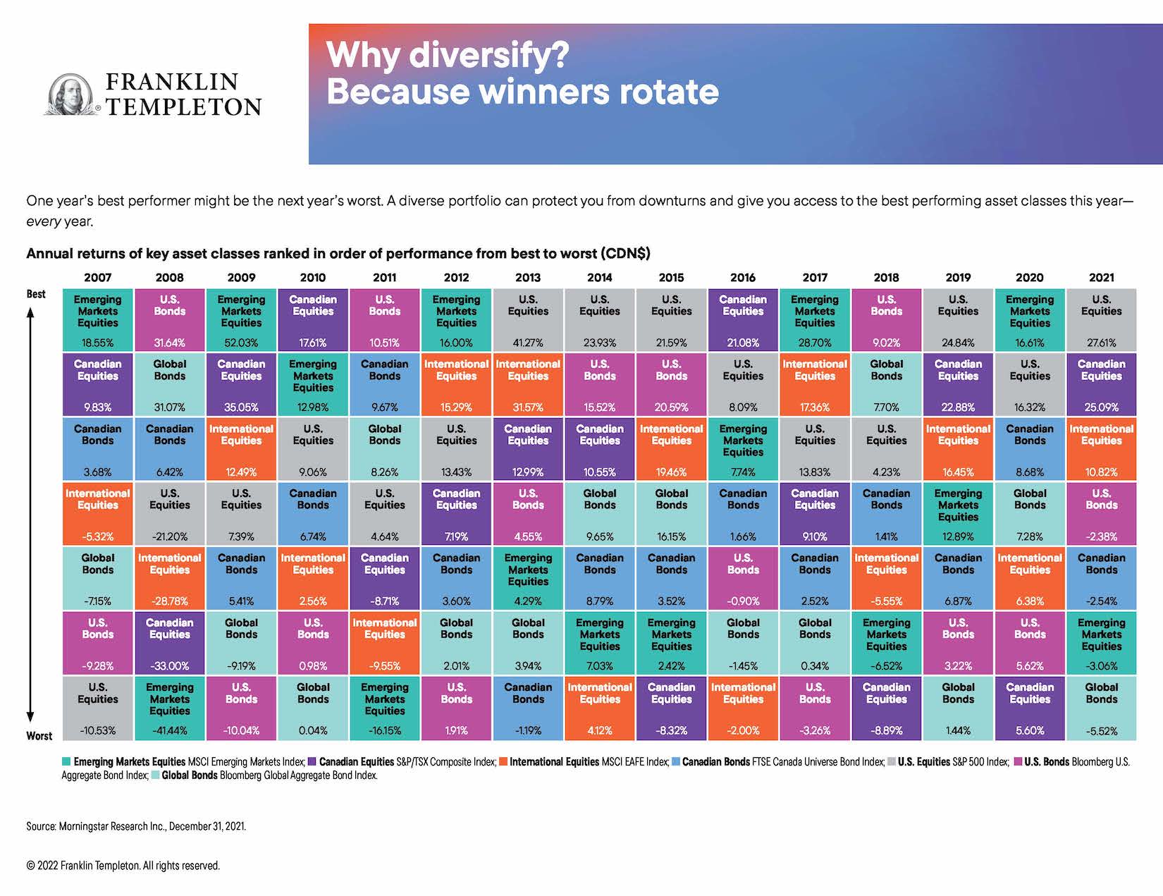
As the column notes, I always enjoyed perusing the annual asset classes rotate chart that investment giant Franklin Templeton used to distribute to financial advisors and media influencers. I still have the 2015 chart on my office wall, even though it’s years out of date.

Curious about the chart’s fate, I asked the company what had become of it, and learned it’s still available but now it’s only in digital format online. As always I find it enormously instructive. It’s still titled Why diversify? Asset classes rotate. As it goes on to explain, “one year’s best performer might be the next year’s worst. A diverse portfolio can protect your from downturns and give you access to the best performing asset classes this year – every year.”

The chart lists annual returns in Canadian dollars, based on various indexes.

Right off the top, you see that U.S. equities [the S&P500 index] are as often as not the top-producing single asset class. It topped the list five of the last nine years: from 2013 to 2015, then again in 2019 and 2021.

On the flip side, bonds tend to be the worst asset class. Over the 15 years between 2007 and 2021, at least one bond fund was at the bottom seven of those years: global bonds [as measured by the Bloomberg Global Aggregate Bond Index] in 2010, 2019 and 2021, US bonds [Bloomberg US. Aggregate Bond Index] in 2019, 2012 and 2017, and Canadian bonds [FTSE Canada Universe Bond index] in 2013. And consider that all those years were considered (in retrospect) a multi-decade bull market for bonds. You can imagine how bonds will look going forward now that interest rates have clearly bottomed and are slowly marching higher.

As you might expect, volatile asset classes like Emerging Markets [measured by the MSCI Emerging Markets index] tend to generate both outsized gains and outsized losses. EM topped the chart in five of the last 15 years (2007, 2009, 2012, 2017 and 2020) but were also at the bottom in 2008 and 2011. EM’s largest gain in that period was 52% in 2009, immediately following the 41% loss in 2008. Therein lies a tale!

The latest Templeton online charts also include a second version titled “Risk is more predictable than returns.” It notes that “Higher returns often come with higher risks. That’s why it’s important to look beyond returns when choosing a potential investment.” It ranks the asset classes from lower risk to higher risk and here the results are remarkably consistent across almost the entire 15-year time span between 2005 and 2021.

The missing alternative asset classes

This is all valuable information but alas, these charts seem to focus almost exclusively on the big two asset classes of stocks and bonds, precisely the two that are the focus of all those popular All-in-one Asset Allocation ETFs pioneered by Vanguard and soon matched by BMO, iShares, Horizons and a few others. Continue Reading…

A higher dividend yield isn’t always better: How to spot the good from the bad to avoid this costly mistake.

is higher yield dividend better

Investors interested in dividends should only buy the highest-yielding Canadian dividend stocks if they meet these criteria — and don’t have these risk factors

Dividend yield is the percentage you get when you divide a company’s current yearly payment by its share price.

The best of the highest-yielding Canadian dividend stocks have a history of success

Follow our Successful Investor philosophy over long periods and we think you’ll likely achieve better-than-average investing results.

Our first rule tells you to buy high-quality, mostly dividend-paying stocks. These stocks have generally been succeeding in business for a decade or more, perhaps much longer. But in any case, they have shown that they have a durable business concept. They can wilt in economic and stock-market downturns, like any stock. But most thrive anew when the good times return, as they inevitably do.

Over long periods, you’ll probably find that a third of your stocks do about as well as you hoped, a third do better, and a third do worse. This is partly due to that random element in stock pricing that we’ve often mentioned. It also grows out of the proverbial “wisdom of the crowd.” The market makes pricing mistakes and continually reverses itself. But the collective opinion of all individuals buying and selling in the market eventually beats any single expert opinion.

Canadian dividend stocks and the dividend tax credit

Canadian taxpayers who hold Canadian dividend stocks get a special bonus. Their dividends can be eligible for the dividend tax credit in Canada. This dividend tax credit — which is available on dividends paid on Canadian stocks held outside of an RRSP, RRIF or TFSA — will cut your effective tax rate.

That means dividend income will be taxed at a lower rate than the same amount of interest income. Investors in the highest tax bracket pay tax of around 29% on dividends, compared to 50% on interest income. At the same time, investors in the highest tax bracket pay tax on capital gains at a rate of about 25%.

The Canadian dividend tax credit is actually split between two tax credits. One is a provincial dividend tax credit and the other is a federal dividend tax credit. The provincial tax credit varies depending on where you live in Canada.

A couple of decades ago, you could assume that dividends would supply up to about one-third of the stock market’s total return. Dividend yields are generally lower today than they were a few years ago, but it’s still safe to assume that dividends will continue to supply perhaps a third of the market’s total return over the next few decades. Continue Reading…

A closer look at Inflation

By Alizay Fatema, Associate Portfolio Manager, BMO ETFs

(Sponsor Content)

While inflation was sidelined by several central banks and deemed as “transitory” for the most part during 2021, the tone shifted promptly this year as back-to-back red-hot inflation prints forced most central banks to go on an interest-rate hiking spree. This aggressive action is being taken to tame inflation otherwise known as the rate of change in prices over time, [1], as it’s persistently high and is eroding the purchasing power of households, reducing consumer spending, and the overall economic well-being.

What are the causes of inflation?

Before we discuss whether inflation will slow down or not, let’s take a step back and analyze what’s causing prices to rise globally in the first place. Most economists attribute this uptick in inflation to several different causes such as:

  • Cost-push inflation driven by supply chain crisis

The COVID-19 outbreak led to a series of lockdowns and restrictions across the globe, which caused supply chain disruptions and labour shortages and ultimately induced cost-push inflation [2], resulting in a surge of prices due to an increase in costs of producing and supplying products and services. World economies are still recovering from this effect, and some of these constraints are fading away as global transportation costs plunge and Chinese production ramps up again. However, the Russian invasion of Ukraine is clearly hampering this progress and further stoking inflation.  [3]

  • Demand-pull inflation fueled by savings, fiscal stimulus, and monetary policy

The pandemic had caused an unconventional recession, and to keep economies afloat, several central banks slashed their interest rates, increased their money supply M2 (a measure of the money supply that includes cash, checking deposits, and easily- convertible near money)., gave out government aid, relief, & stimulus payments as part of the fiscal response during 2020 & 2021. As businesses reopen this year after remaining shuttered and reducing their production and services, they could not meet the pent-up demand driven by savings accumulated during the pandemic along with the monetary & fiscal stimulus. Thus, strong consumer demand, fueled by robust growth in employment, has outstripped supply temporarily for several products & services such as air travel, hotels, cars, etc., resulting in demand-pull inflation [4].


A series of interest rate hikes to curb sky-high inflation

The price increases for gasoline, food, and housing caused Canada’s inflation to rise to a 39-year high of 8.1% in June 2022. The markets got some respite in August as headline inflation came down to 7% and further weakened in September to 6.9% from a year ago, as gasoline prices fell. However, the recent data was disappointing as the dramatic increase in food prices was unexpected.

On a similar note, south of the border, the U.S. inflation spiked to 9.1% in June 2022, the highest level since 1981. Although headline U.S. inflation reported for September was up by 8.2% from a year earlier (down from the peak of June 2022), the core U.S. consumer price index (ex. food & energy) rose to a 40-year high, increasing to 6.6% from a year ago, which is a cause of concern as its squeezing households by outpacing the growth in wages.

To dial down the surge in prices, the Federal Reserve engaged in a series of rate hikes not seen since the late 1980s, increasing the front-end interest rate to 3.25% in September. The Bank of Canada followed suit by raising rates through consecutive outsized hikes, bringing its target overnight rate to 3.75% in October. Given inflation is still sky-high in both countries and way above their 2% target, both Fed & Boc are expected to raise their short-term rates again. Both central banks are maintaining their hawkish tones, which means the rates will be further raised to fight against raging inflation. However, they may dial back the pace of their hikes amid recession fears.

When will we see a slowdown in inflation?

Looking at recent CPI prints, the question arises whether the U.S. and Canada have passed peak inflation. The truth is it’s hard to predict what lies ahead. Prices in some sectors, such as gas and used automobiles, have dropped, which is a good sign. However, prices for certain goods & services are “stickier” than others, such as rent, insurance, health care or dining out, meaning that they are likely to stay at their current levels or increase even further, so inflation may stick around for a while. Moreover, higher wages and inflation may continuously feed into each other, resulting in a wage-price spiral [5] which may result in further rate hikes, causing additional damage. Continue Reading…

When will this be over, How deep will it go, and How will it end?

By Noah Solomon

Special to the Financial Independence Hub

Against a backdrop of sky-high inflation, rising rates, and growing recession concerns, stocks have had a dismal year, with technology and unprofitable growth companies experiencing particularly severe losses.

Given the carnage in global markets, investors are pondering the following three questions:

  1. How long will the carnage last?
  2. How much more will equities fall before hitting bottom?
  3. What might it take for equity fortunes to turn?

In my commentary below, I address these questions from a historical perspective.

The current Bear Market: Fairly Average by Historical Standards

To begin, I analyzed all peak-tough declines of more than 15% in the S&P 500 Index since 1950, which are listed in the following table:


The average length of all 15%+ declines is 310.9 days. Taking the recent peak on January 3, the current bear market clocks in at 270 days as of the end of September. The time is at hand when the current decline will have become average from a historical standpoint. In terms of magnitude, the average decline has been 28.7%. As is the case with duration, we are near the point at which the current decline in prices can be construed as garden variety, with the S&P 500 Index down 24.3% from its early January peak through September 30.

Although historical averages are a useful guidepost for contextualizing where the current decline in stocks stands, they must nonetheless be taken with a large grain of salt. Of the 17 declines in the S&P 500 index since 1950, 14 have been at least 5% less or 5% more severe than the average decline of -28.7%, and five of them have fallen outside of the +/- 10% band of the average. There is no guarantee that markets will continue to decline until they match the historical average. Similarly, it is entirely possible that the current decline will eventually exceed the historical norm (perhaps meaningfully so).

Every bear market is unique in its own way. They may share certain commonalities but none of them are exactly alike. They differ either in terms of their causes, their macroeconomic environments, or the accompanying fiscal and monetary responses. Accordingly, we further scrutinized the data to ascertain whether there are any factors that can be associated with worse than run of the mill bear markets.

One Hell summons another

We found that past bear market patterns can be well-summarized by the Latin expression “abyssus abyssum invocat,” which means “one hell summons another.” Historically, once stocks have already suffered precipitous declines, they have tended to continue falling over the short term. Of the eight losses that have breached the -25% threshold, the average peak-trough loss was 39.1%. Alternately stated, during times when stocks declined by at least 25%, the panic train went into high gear, with stocks declining a further 14.1% on average.

Beware the “R” Word

Bear markets that have been accompanied by recessions have tended to be more vicious than their non-recession counterparts. Of the 17 declines in the S&P 500 Index of at least 15%, nine have been accompanied by recessions. The average length of these nine episodes is 427.8, which clocks in at a full 116 days longer than the average for all 17 observations. Continue Reading…

What we’re doing in this beet-red Bear market

Unless you’ve been living under a rock, you probably have heard that the global stock market has been on a downward spiral. Yup, the bear has entered the room and many of us are seeing beet-red market conditions over the last number of months.

Year to date the TSX is down more than 13%.

TSX YTD performance

Meanwhile, the S&P 500 is down more than 22% year to date.

S&P500 YTD performance

The typically high-flying NASDAQ is down more than 30% year to date.

NASDAQ YTD performance

For those investors who only started investing in 2021 or those who are used to the only-going-up-bull-market condition, the recent downward trend is undoubtedly hard to stomach.

Given that we’ve been DIY investing for more than a decade, some readers have reached out and asked what we’re doing in this bear, beet-red market condition.

So what are we doing?

Allow me to explain.

Think long term

First of all, it’s essential to think long term. If you’re still in the accumulation phase, like us, you should be wishing and hoping for an extended bear market.

Why?

Because investors in the accumulation phase will want to buy stocks at discounted prices.

How often do you see the likes of Royal Bank and TD having an initial dividend yield of over 4.1%? The 10-year historical average dividend yield for Royal Bank is 3.92% while the 10-year historical average dividend yield for TD is 3.8%. Continue Reading…