Inflation

Inflation

Value Investing: Looking beneath the surface

Image from Outcome/QuoteInspector.com.

By Noah Solomon

Special to Financial Independence Hub

It goes without saying that 2022 was a less than stellar year for equity investors. The MSCI All Country World Index of stocks fell 18.4%. There was virtually nowhere to hide, with equities in nearly every country and region suffering significant losses. Canadian stocks were somewhat of a standout, with the TSX Composite Index falling only 5.8% for the year.

Looking below the surface, there was an interesting development underlying these broader market movements, with value stocks far outpacing their growth counterparts. Globally, value stocks suffered a loss of 7.5% as compared to a decline of 28.6% in growth stocks. This substantial outperformance was pervasive across countries and regions, including the U.S., Europe, Asia, and emerging markets. In the U.S., 2022’s outperformance of value stocks was the highest since the collapse of the tech bubble in 2000.

These historically outsized numbers have left investors wondering whether value’s outperformance has any legs left and/or whether they should now be tilting their portfolios in favor of a relative rebound in growth stocks. As the following missive demonstrates, value stocks are far more likely than not to continue outperforming.

Context is everything: Value is the “Dog” that finally has its Day

From a contextual perspective, 2022 followed an unprecedented period of value stock underperformance.

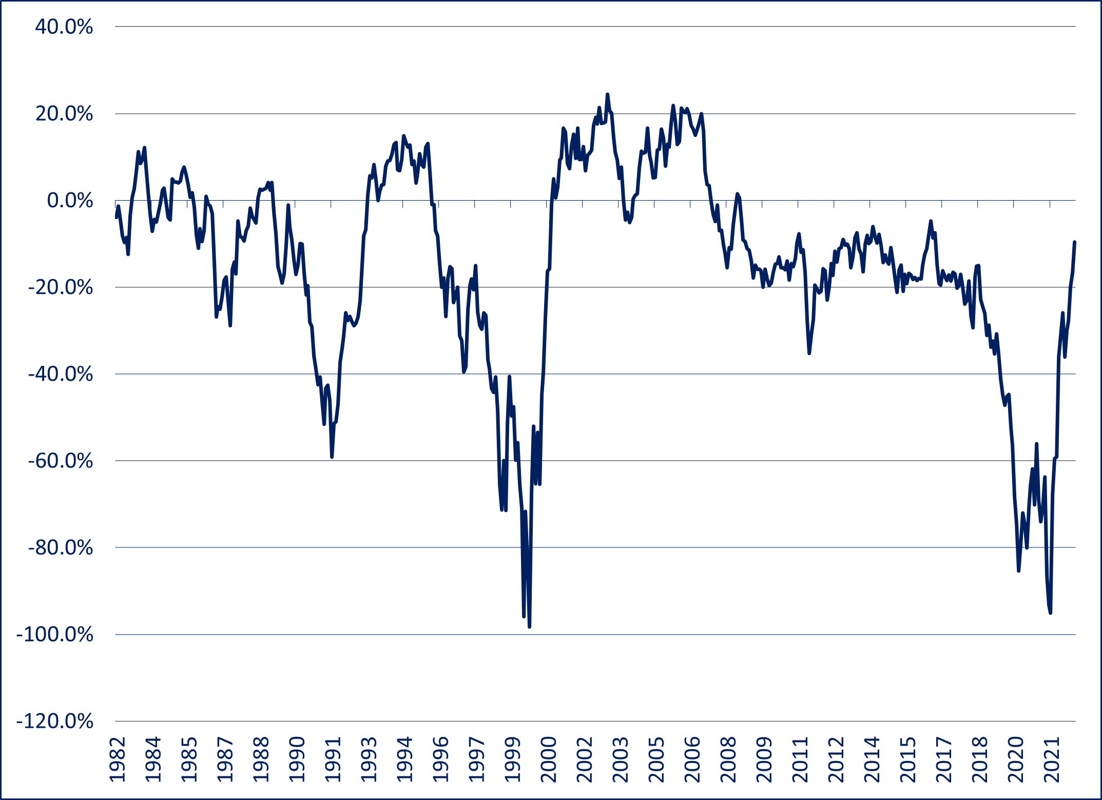
U.S Value vs. U.S. Growth Stocks – Rolling 3 Year Returns: 1982-2022


Although there have been (and will be) times when value stocks underperform their growth counterparts, the sheer scale of value’s underperformance in the several years preceding 2022 is almost without precedent in modern history. The extent of value vs. growth underperformance is matched only by that which occurred during growth stocks’ heyday in the internet bubble of the late 1990s.

Shades of Tech Bubble Insanity

The relative performance of growth vs. value stocks cannot be deemed either rational or irrational without analyzing their relative valuations. To the extent that the phenomenal winning streak of growth vs. value stocks in the runup to 2022 can be justified by commensurately superior earnings growth, it can be construed as rational. On the other hand, if the “rubber” of growth’s outperformance never met the “road” of superior profits, then at the very least you need to consider the possibility that crazy (i.e. greed, hope, etc.) had indeed entered the building.

The extreme valuations reached by many growth companies during the height of the pandemic bring to mind a warning that was issued by a market commentator during the tech bubble of the late 1990s, who stated that the prices of many stocks were “not only discounting the future, but also the hereafter.”

U.S. Value Stocks: Valuation Discount to U.S. Growth Stocks: (1995-2022)


Based on forward PE ratios, at the end of 2021 U.S. value stocks stood at a 56.3% discount to U.S. growth stocks. From a historical perspective, this discount is over double the average discount of 27.9% since 1995 and is matched only by the 56.6% discount near the height of the tech bubble in early 2000. This valuation anomaly was not just a U.S. phenomenon, with global value stocks hitting a 57.5% discount to global growth stocks, more than twice their average discount of 27.6% since 2002 and even larger than that which prevailed in early 2000 at the peak of the tech mania. Continue Reading…

$1.7 million to retire: doable or out of reach?

Front page of Wednesday’s Financial Post print edition.

Plenty of press this week over a BMO survey that found Canadians now believe they’ll need $1.7 million to retire, compared to just $1.4 million two years ago (C$). The main reason for the higher nest-egg target is of course inflation.

As you’d expect, the headline of the story alone attracted plenty of media attention. I heard about it on the car radio listening to 102.1 FM [The Edge]: there, a female broadcaster who was clearly of Millennial vintage deemed the $1.7 million ludicrously out of reach, personalizing it with her own candid confession that she herself hasn’t even begun to save for Retirement. Nor did she seem greatly fussed about it.

Here’s the Financial Post story which ran in Wednesday’s paper: a pick-up of a Canadian Press feed; a portion is shown to the left. The writer, Amanda Stephenson, quoted BMO Financial Group’s head of wealth distribution and advisory services Caroline Dabu to the effect the $1.7 million number says more about the country’s economic mood than about real-life retirement necessities.

BMO’s own client experience finds that “many overestimate the number that they need to retire,” she told CP, “It really does have to be taken at an individual level, because circumstances are very different … But $1.7 million, I would say, is high.”

Here’s my own take and back-of-the-envelope calculations. Keep in mind most of the figures below are just guesstimates: those who have financial advisors or access to retirement calculators can get more precise numbers and estimates by using those resources. I may update this blog with input from any advisors or retirement experts reading this who care to fill in the blanks by emailing me.

A million isn’t what is used to be

Image via Tenor.com

Back in the old days, a million dollars was considered a lot of money, even if that amount today likely won’t get you a starter home in Toronto or Vancouver. This was highlighted in one of those Austin Powers movies, in which Mike Myers (Dr. Evil) rubs his hands in glee but dates himself by threatening to destroy everything unless he’s given a “MILLL-ion dollars,” as if it were an inconceivably humungous amount.

The quick-and-dirty calculation of how much $1 million would generate in Retirement depends of course on your estimated rate of return. When interest rates were near zero, this resulted in a depressing conclusion: 1% of $1 million is $10,000 a year, or less than $1,000 a month pre-tax. When my generation started working in the late 70s, a typical entry-level job paid around $12,000 a year so you could figure that $1 million plus the usual government pensions would get you over the top in retirement.

Inflation has put paid to that outcome but consider two rays of hope, as I explained in a recent MoneySense Retired Money column. To fight inflation, Ottawa and most central banks around the world have hiked interest rates to more reasonable levels. Right now you can get a GIC paying somewhere between 4% and 5%. Conservatively, 4% of $1 million works out to $40,000 a year. 4% of $1.7 million is $68,000 a year. That certainly seems to be a liveable amount. More so if you have a paid-for home: as I say in my financial novel Findependence Day, “the foundation of Financial Independence is a paid-for home.”

Couples have it easier

If you’re one half of a couple, presumably two nest eggs of $850,000 would generate the same amount: for simplicity we’ll assume a 4% return, whether in the form of interest income or high-yielding dividend stocks paid out by Canadian banks, telecom companies or utilities. I’d guess most average Canadians would use their RRSPs to come up with this money.

This calculation doesn’t even take into consideration CPP and OAS, the two guaranteed (and inflation-indexed) government-provided pensions. CPP can be taken as early as age 60 and OAS at 65, although both pay much more the longer you wait, ideally until age 70. Again, couples have it easier, as two sets of CPP/OAS should add another $20,000 to $40,000 a year to the $68,000, depending how early or late one begins receiving benefits.

This also assumes no employer-pension, generally a good assumption given that private-sector Defined Benefit pensions are becoming rarer than hen’s teeth. I sometimes say to young people in jest that they should try and land a job in either the federal or provincial governments the moment they graduate from college, then hang on for 40 years. Most if not all governments (and many union members) offer lucrative DB pensions that are guaranteed for life with taxpayers as the ultimate backstop, and indexed to inflation. Figure one of these would be worth around $1 million, and certainly $1.7 million if you’re half of a couple who are in such circumstances.

Private-sector workers need to start RRSPs ASAP

But what if you’re bouncing from job to job in the private sector, which I presume will be the fate of our young broadcaster at the Edge? Then we’re back to what our flippant commentator alluded to: if she doesn’t start to take saving for Retirement seriously, then it’s unlikely she’ll ever come up with $1.7 million. In that case, her salvation may have to come either from inheritance, marrying money or winning a lottery.

For those who prefer to have more control over their financial future, recall the old saw that the journey of a thousand miles begins with a single step. In Canada, that step is to maximize your RRSP contributions every year, ideally from the moment you begin your first salaried job. Divide $1.7 million by 40 and you get $42,400 a year that needs to be contributed. OK, I admit I’m shocked by that myself but bear with me. The truth is that no one even is allowed to contribute that much money every year into an RRSP. Normally, the limit is 18% of earned income and the 2023 maximum RRSP contribution limit is $30,780 (and $31,560 for the 2024 taxation year.) Continue Reading…

Resource Stocks provide long-term gains and inflation hedging

Photo from iStock

Including good stocks for long-term investment gains from the Resource section can be especially helpful in times of inflation. Learn more below.

For most investors, resource stocks should make up only a limited portion of their portfolios. That means that while we think you should maintain some exposure to resource stocks, you should still aim to balance your portfolio across most if not all of the five economic sectors.

If you want resource stocks in your diversified portfolio, then you need to know how to find good stocks in that sector for long-term investment gains.

Resource stocks, though volatile, tend to rise with inflation and can be good stocks for long-term investment gains

The resource sector is subject to wide and unpredictable swings in the prices it gets for its products. In the rising phase of the business cycle, when business is booming, resource demand expands faster than resource supply, so resource prices shoot up. This balloons profits at resource companies. When the economy slumps, resource prices fall, and this drags down resource profits and stock prices.

In addition to rising and falling with the business cycle, however, resource stocks have a history of rising along with long-term inflationary trends. This gives them a rare ability: they provide a hedge against inflation.

Back in the inflationary 1970s and 1980s, investors used to see this hedge-against-inflation ability as the main reason for buying resource stocks. But until recently, they rarely thought of it. That’s because inflation had waned for three decades.

Inflation peaked at a yearly rate around 13% in the early 1980s. It fell by two-thirds from that level by the middle of the decade. It went through a series of peaks and valleys, but had been working its way downward ever since.

However, after years of relative stability, inflation has come back to levels not seen in decades.

While the cost of just about everything has gone up, nobody can predict trends in inflation or interest rates with any consistency. And we disagree with investors who think we are on the verge of a huge outburst of never-ending price increases.

Even so, adding top Resource stocks to your portfolio lets prosper two ways: you can profit even without inflation — and these stocks will also provide an added boost in inflationary times.

It’s important to know your risk tolerance when investing in good stocks for long-term investment gains — including Resource stocks

There are several considerations that go into a successful growth investing strategy. Still, many investors overlook a number of important factors that can lower their risk.

In the end, there’s no such thing as risk-free investing. The tips below for lowering your growth investing strategy risk have long been part of the Successful Investor approach.

  • Balance your cyclical risk
  • Be skeptical of companies that mainly grow through acquisitions
  • Don’t overindulge in aggressive investments
  • Keep an eye out on a growth stock’s debt
  • Keep stock market trends in perspective
  • Look for growth stocks that have ownership of strong brand names and an impeccable reputation
  • The best long-term growth stocks should have the ability to profit from secular trends

Meantime, we continue to recommend that you cut your risk in the volatile resource sector by investing mainly in stocks of profitable, well-established mining companies with high-quality reserves. And as mentioned, resource stocks (and this includes oil and gas, of course) should make up only a limited portion of your portfolio. Continue Reading…

Retired Money: Inflation and some compensations in federal tax brackets and contribution limits


My latest MoneySense Retired Money column has just been published and can be accessed by clicking the highlighted headline: Inflation and investments: Heads up if you’re retired or retiring soon

It looks at the anxiety of would-be retirement savers in the light of soaring inflation and in particular, a recent Leger Questrade poll that looked at how inflation is affecting Canadians’ intentions to contribute to TFSAs and RRSPs. My Hub blog on this includes 4 charts on the topic.

Not surprisingly, inflation is a particular concern for retirees and those hoping to retire soon. The 2023 RRSP Omni report found that while 87% of Canadians are worried about rising prices, it also found 73% of RRSP owners still plan to contribute again this year, and so do 79% of TFSA holders. That’s despite the fact 69% fret that inflation will impact their RRSPs’ value and 64% worry about their TFSAs’ value. Seven in ten with RRSPs and 64% with TFSAs are concerned about inflation and a possible recession: 25% “very” concerned.

A Silver Lining

The MoneySense column also summarizes some of the compensating factors that Ottawa builds into the retirement saving system: as inflation rises, so too do Tax brackets, the Basic Personal Amount (BPA: the tax-free zone for the first $15,000 or so of annual earnings), and of course TFSA contribution limits (now $6500 in 2023 because of inflation adjustments). This was nicely summarized late in 2022 by Jamie Golombek in the FP, and reprised in this Hub blog early in the new year.

Because tax brackets and contribution levels are linked to inflation, savers benefit from a little more tax-sheltered (or tax deferred) contribution room this year. The RRSP dollar limit for 2023 is $30,790, up from $29,210 in 2022, for those who earn enough to qualify for the maximum. And TFSA room is now $6,500 this year, up from $6,000, because of an inflation adjustment. As Golombek noted, the cumulative TFSA limit is now $88,000 for someone who has never contributed to one.

Golombek, managing director, Tax & Estate planning for CIBC Private Wealth, wrote that in November 2022, the Canada Revenue Agency said the inflation rate for indexing 2023 tax brackets and amounts would be 6.3%: “The new federal brackets are: zero to $53,359 (15%); more than $53,359 to $106,717 (20.5%); more than $106,717 to $165,430 (26%); more than $165,430 to $235,675 (29%); and anything above that is taxed at 33%.”

Another break is that the yearly “tax-free zone” for all who earn income is rising. The Basic Personal Amount (BPA) —the annual amount of income that can be earned free of any federal tax — rises to $15,000 in 2023, as legislated in 2019.

CPP and OAS inflation boosts in late January

 On top of that, retirees collecting CPP and/or OAS can expect significant increases when the first payments go out on or around Jan. 27, 2023. (I include our own family in this). There’s more information here. Continue Reading…

Searching for a Safe Withdrawal Rate: the Effect of Sampling Block Size

Image by Mohamed Hassan from Pixabay

By Michael J. Wiener

Special to the Financial Independence Hub

How much can we spend from a portfolio each year in retirement?  An early answer to this question came from William Bengen and became known as the 4% rule.  Recently, Ben Felix reported on research showing that it’s more sensible to use a 2.7% rule.

Here, I examine how a seemingly minor detail, the size of the sampling blocks of stock and bond returns, affects the final conclusion of the safe withdrawal percentage.  It turns out to make a significant difference.  In my usual style, I will try to make my explanations understandable to non-specialists.

The research

Bengen’s original 4% rule was based on U.S. stock and bond returns for Americans retiring between 1926 and 1976.  He determined that if these hypothetical retirees invested 50-75% in stocks and the rest in bonds, they could spend 4% of their portfolios in their first year of retirement and increase this dollar amount with inflation each year, and they wouldn’t run out of money within 30 years.

Researchers Anarkulova, Cederburg, O’Doherty, and Sias observed that U.S. markets were unusually good in the 20th century, and that foreign markets didn’t fare as well.  Further, there is no reason to believe that U.S. markets will continue to perform as well in the future.  They also observed that people often live longer in retirement than 30 years.

Anarkulova et al. collected worldwide market data as well as mortality data, and found that the safe withdrawal rate (5% chance of running out of money) for 65-year olds who invest within their own countries is only 2.26%!  In follow-up communications with Felix, Cederburg reported that this increases to 2.7% for retirees who diversify their investments internationally.

Sampling block size

One of the challenges of creating a pattern of plausible future market returns is that we don’t have very much historical data.  A century may be a long time, but 100 data points of annual returns is a very small sample.

Bengen used actual market data to see how 51 hypothetical retirees would have fared.  Anarkulova et al. used a method called bootstrapping.  They ran many simulations to generate possible market returns by choosing blocks of years randomly and stitching them together to fill a complete retirement.

They chose the block sizes randomly (with a geometric distribution) with an average length of 10 years.  If the block sizes were exactly 10 years long, this means that the simulator would go to random places in the history of market returns and grab enough 10-year blocks to last a full retirement.  Then the simulator would test whether a retiree experiencing this fictitious return history would have run out of money at a given withdrawal rate.

In reality, the block sizes varied with the average being 10 years.  This average block size might seem like an insignificant detail, but it makes an important difference.  After going through the results of my own experiments, I’ll give an intuitive explanation of why the block size matters.

My contribution

I decided to examine how big a difference this block size makes to the safe withdrawal percentage.  Unfortunately, I don’t have the data set of market returns Anarkulova et al. used.  I chose to create a simpler setup designed to isolate the effect of sampling block size.  I also chose to use a fixed retirement length of 40 years rather than try to model mortality tables.

A minor technicality is that when I started a block of returns late in my dataset and needed a block extending beyond the end of the dataset, I wrapped around to the beginning of the dataset.  This isn’t ideal, but it is the same across all my experiments here, so it shouldn’t affect my goal to isolate the effect of sampling block size.

I obtained U.S. stock and bond returns going back to 1926.  Then I subtracted a fixed amount from all the samples.  I chose this fixed amount so that for a 40-year retirement, a portfolio 75% in stocks, and using a 10-year average sampling block size, the 95% safe withdrawal rate came to 2.7%.  The goal here was to use a data set that matches the Anarkulova et al. dataset in the sense that it gives the same safe withdrawal rate.  I used this dataset of reduced U.S. market returns for all my experiments.

I then varied the average block size from 1 to 25 years, and simulated a billion retirements in each case to find the 95% safe withdrawal rate.  This first set of results was based on investing 75% in stocks.  I repeated this process for portfolios with only 50% in stocks.  The results are in the following chart.

The chart shows that the average sample size makes a significant difference.  For comparison, I also found the 100% safe withdrawal rate for the case where a herd of retirees each start their retirement in a different year of the available return data in the dataset.  In this case, block samples are unbroken (except for wrapping back to 1926 when necessary) and cover the whole retirement.  This 100% safe withdrawal rate was 3.07% for 75% stocks, and 3.09% for 50% stocks.

I was mainly concerned with the gap between two cases: (1) the case similar to the Anarkulova et al. research where the average sampling block size is 10 years and we seek a 95% success probability, and (2) the 100% success rate for a herd of retirees case described above.  For 75% stock portfolios, this gap is 0.37%, and it is 0.32% for portfolios with 50% stocks.

In my opinion, it makes sense to add an estimate of this gap back onto the Anarkulova et al. 95% safe withdrawal rate of 2.7% to get a more reasonable estimate of the actual safe withdrawal rate.  I will explain my reasons for this after the following explanation of why sampling block sizes make a difference.

Why do sampling block sizes matter?

It is easier to understand why block size in the sampling process makes a difference if we consider a simpler case.  Suppose that we are simulating 40-year retirements by selecting two 20-year return histories from our dataset.

For the purposes of this discussion, let’s take all our 20-year return histories and order them from best to worst, and call the bottom 25% of them “poor.”

If we examine the poor 20-year return histories, we’ll find that, on average, stock valuations were above average at the start of the 20-year periods and below average at the end.  We’ll also find that investor sentiment about stocks will tend to be optimistic at the start and pessimistic at the end.  This won’t be true of all poor 20-year periods, but it will be true on average.

When the simulator chooses two poor periods in a row to build a hypothetical retirement, there will often be a disconnect in the middle.  Stock valuations will jump from low to high and investor sentiment from low to high instantaneously, without any corresponding instantaneous change in stock prices.  This can’t happen in the real world. Continue Reading…